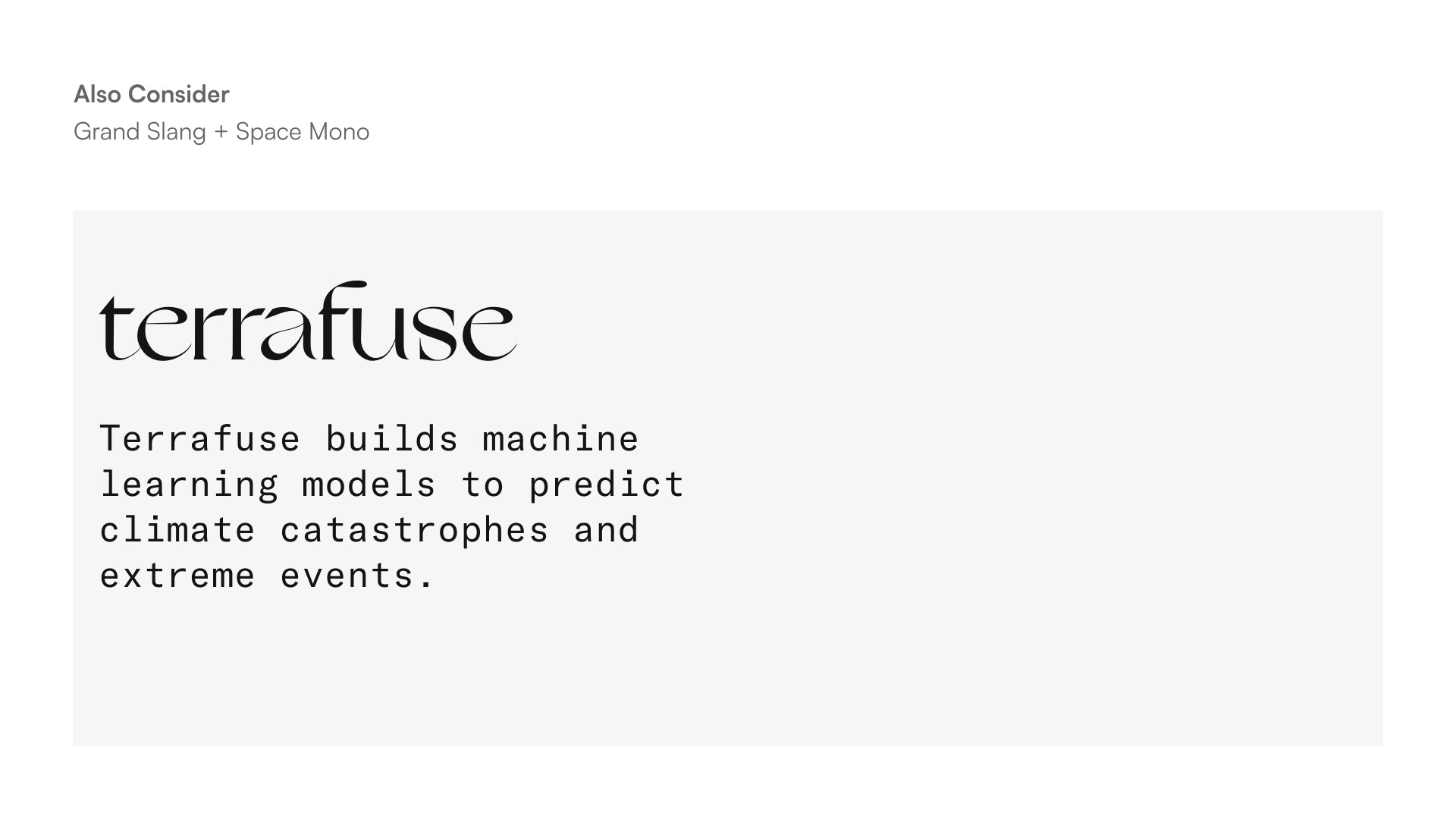
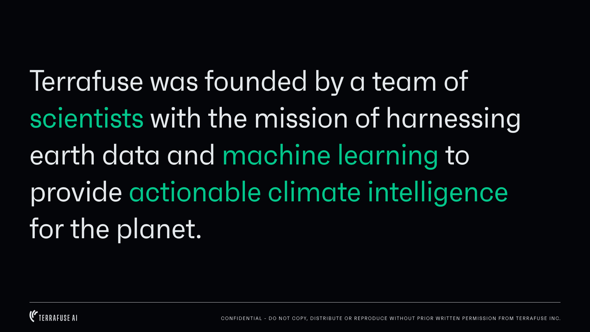
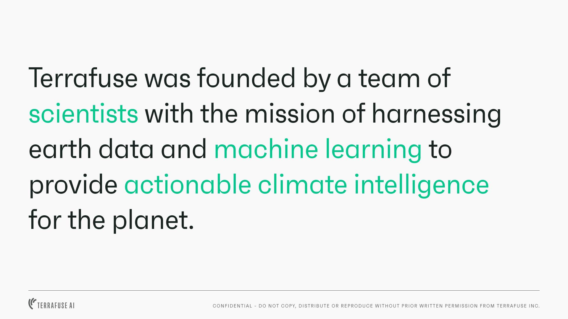
Founded in 2018, Terrafuse is a seed-stage startup building machine learning models to predict climate catastrophes and extreme events.
I worked with the CEO and Director of Strategy and Operations to update their visual identity messaging.
The high-level goals were:
1) Legitimise Terrafuse in the eyes of customers and investors that we want to attract
2) Convey Terrafuse’s value proposition and position the org as scientific, progressive and reliable (more on this later)
2) Convey Terrafuse’s value proposition and position the org as scientific, progressive and reliable (more on this later)
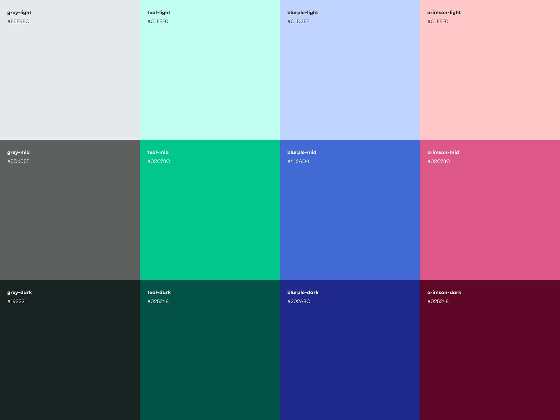
The deliverables outlined were brand assets (logo, colour palette, typeface, images), brand guidelines (a brand book), copy, an updated website and a pitch deck template.
Discovery and Brand Strategy
I led a discovery workshop with stakeholders to better understand where the organisation was and where it was going. We documented our findings using a template I got from Allegra Poschmann of Pact.


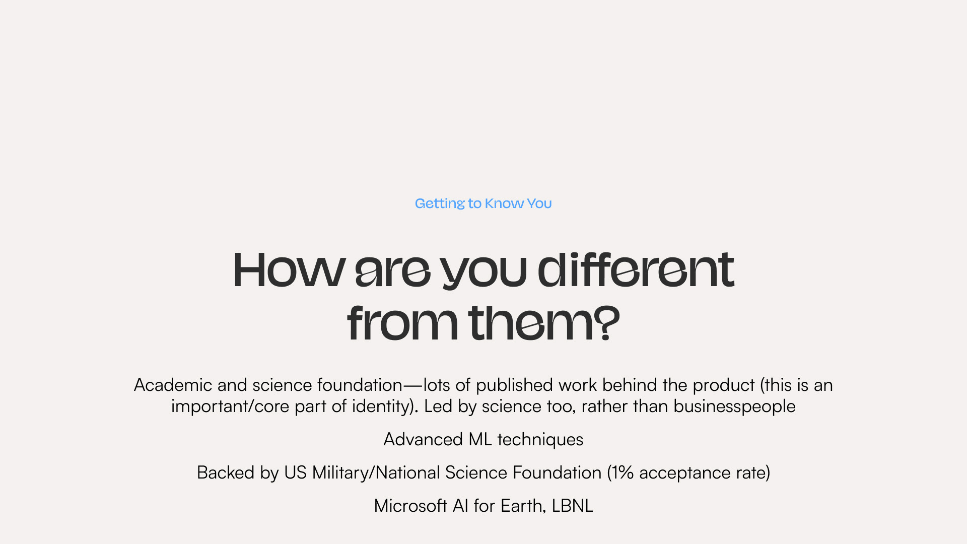

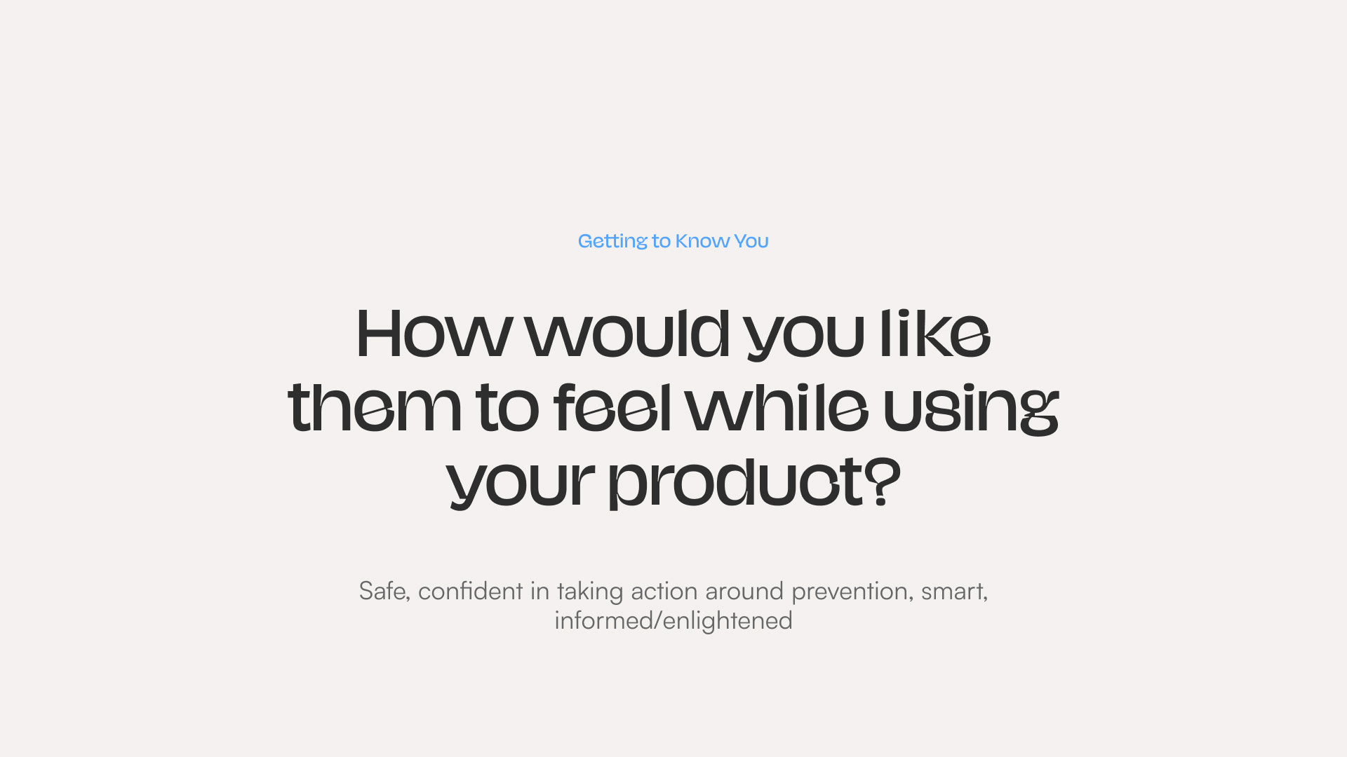
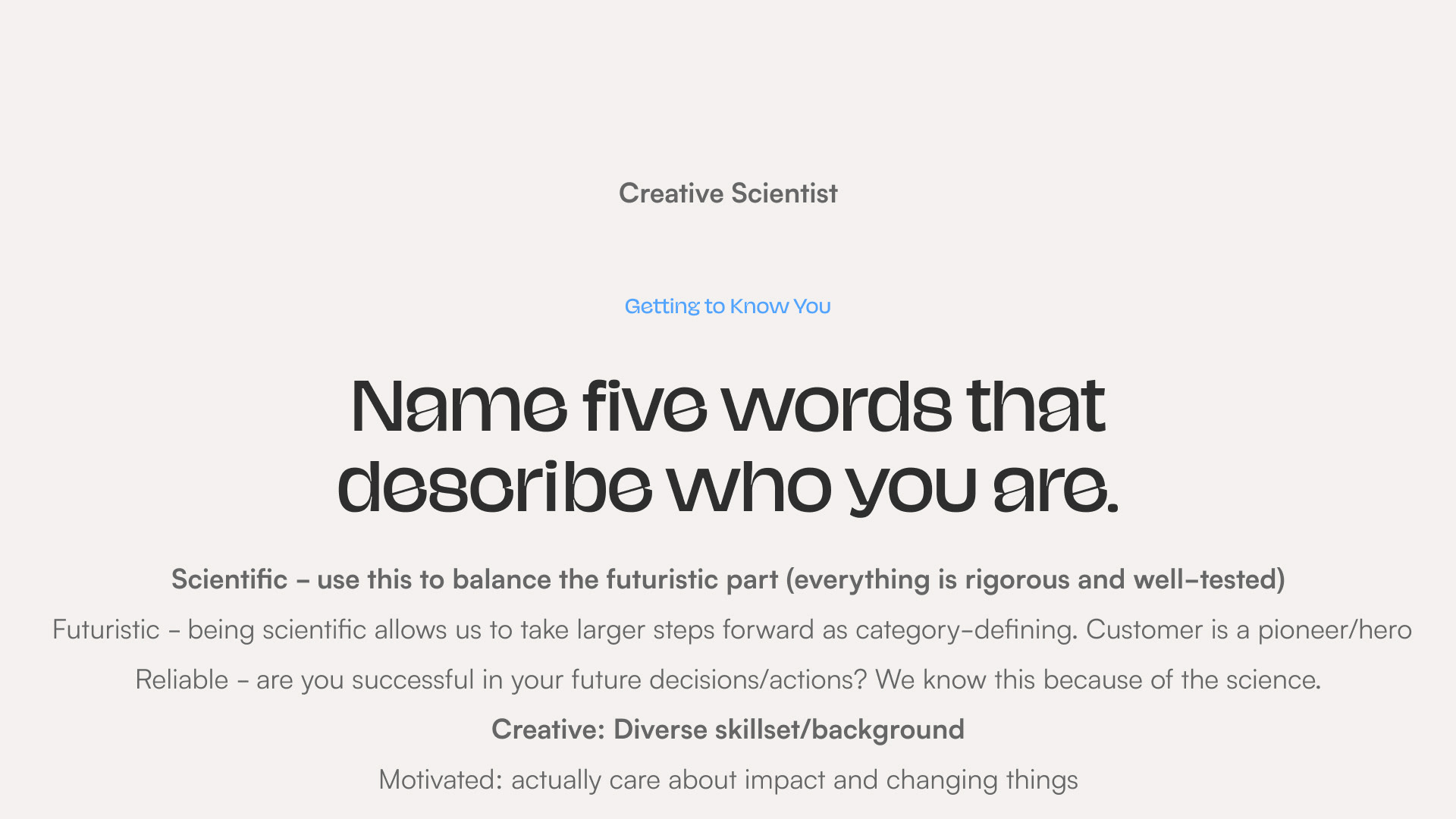
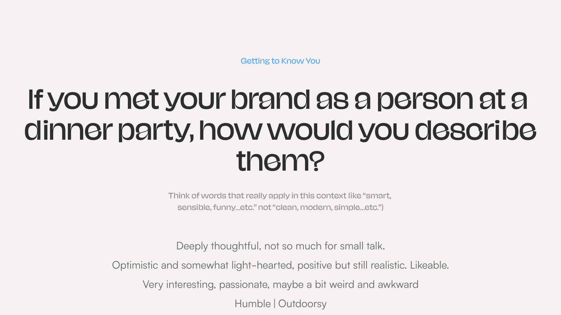


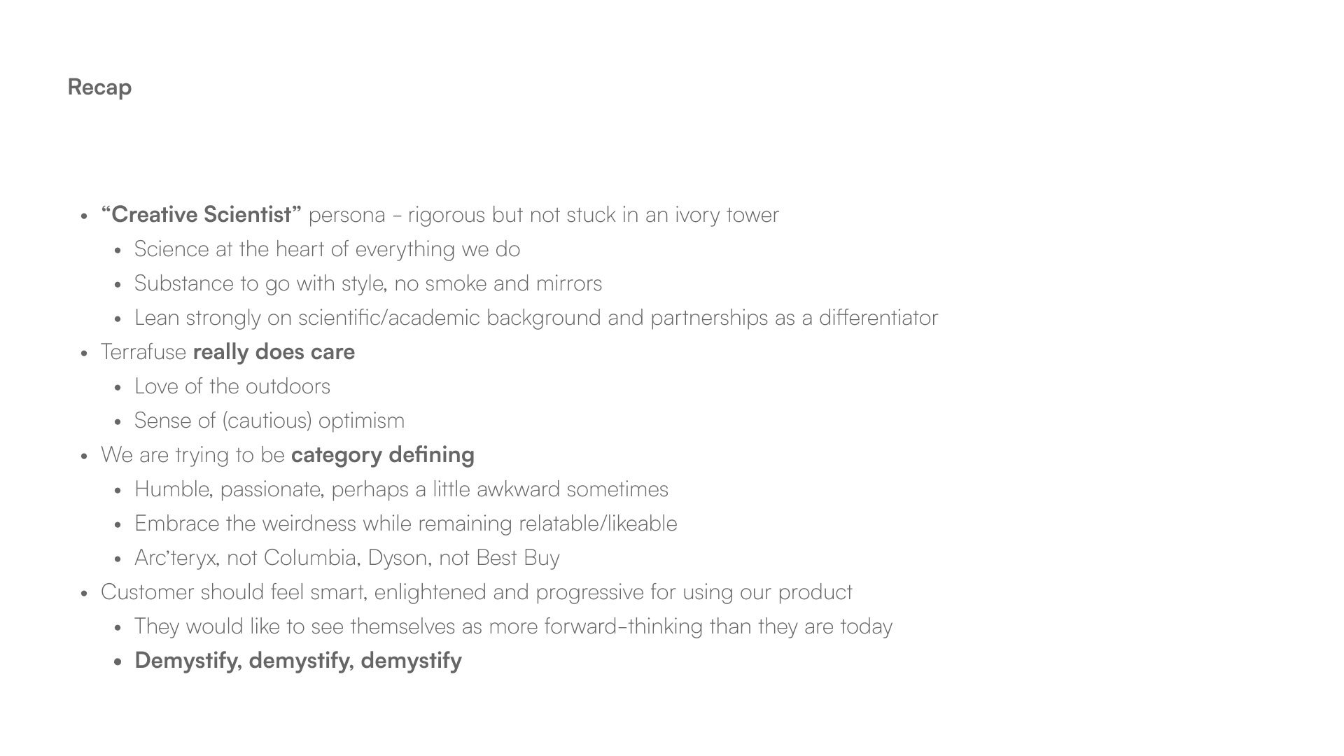
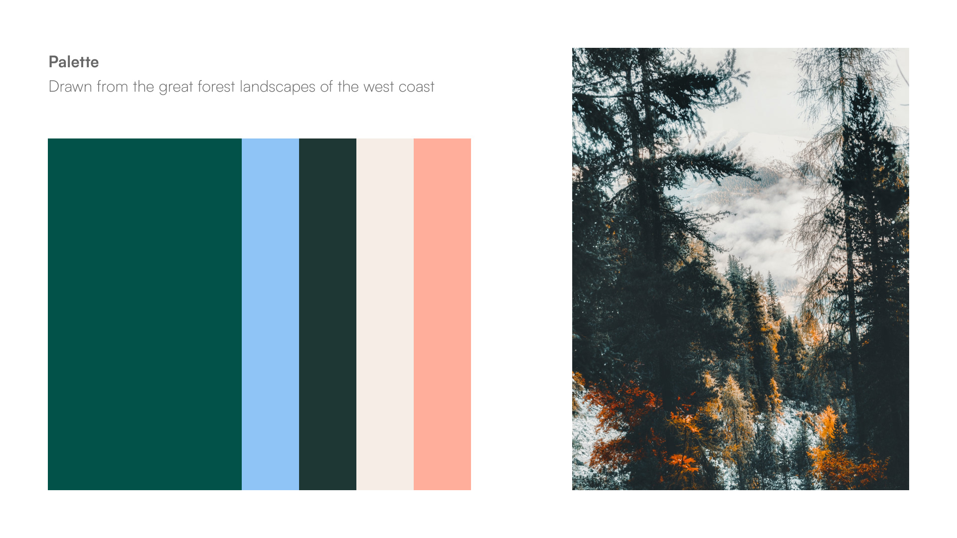
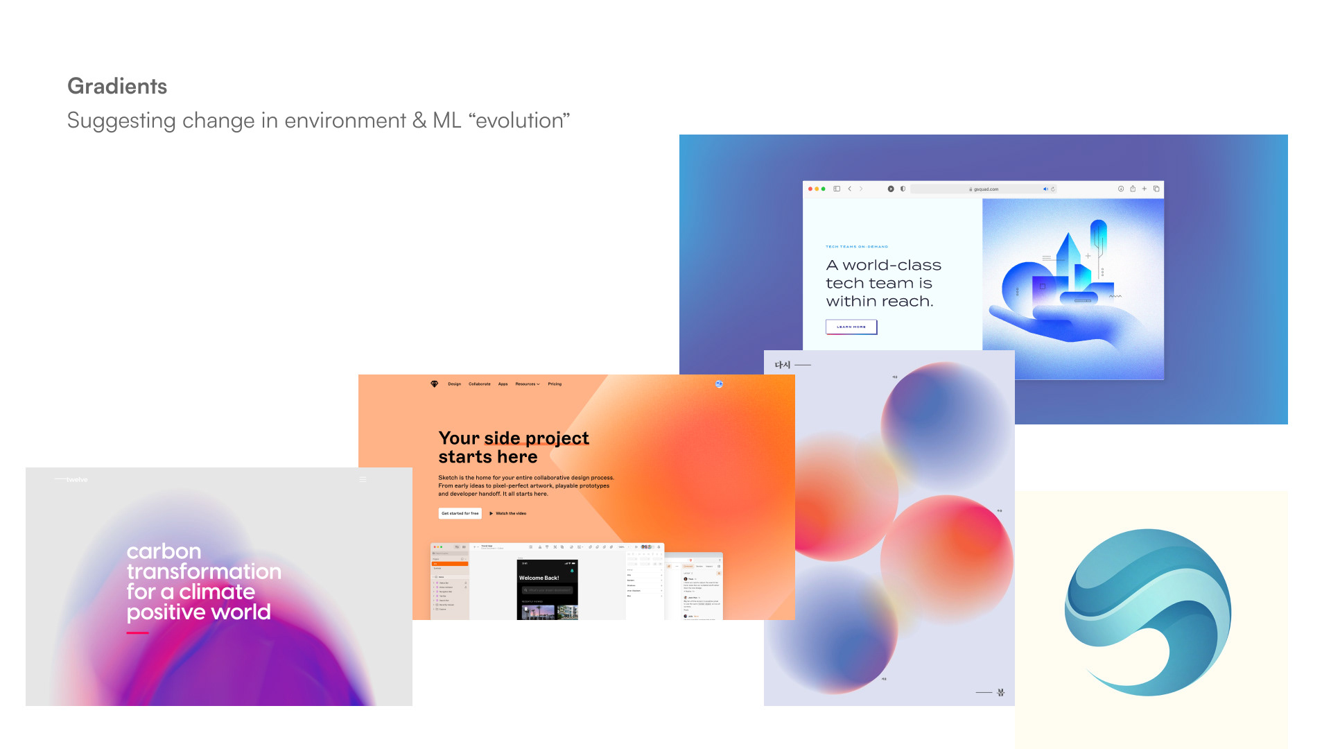
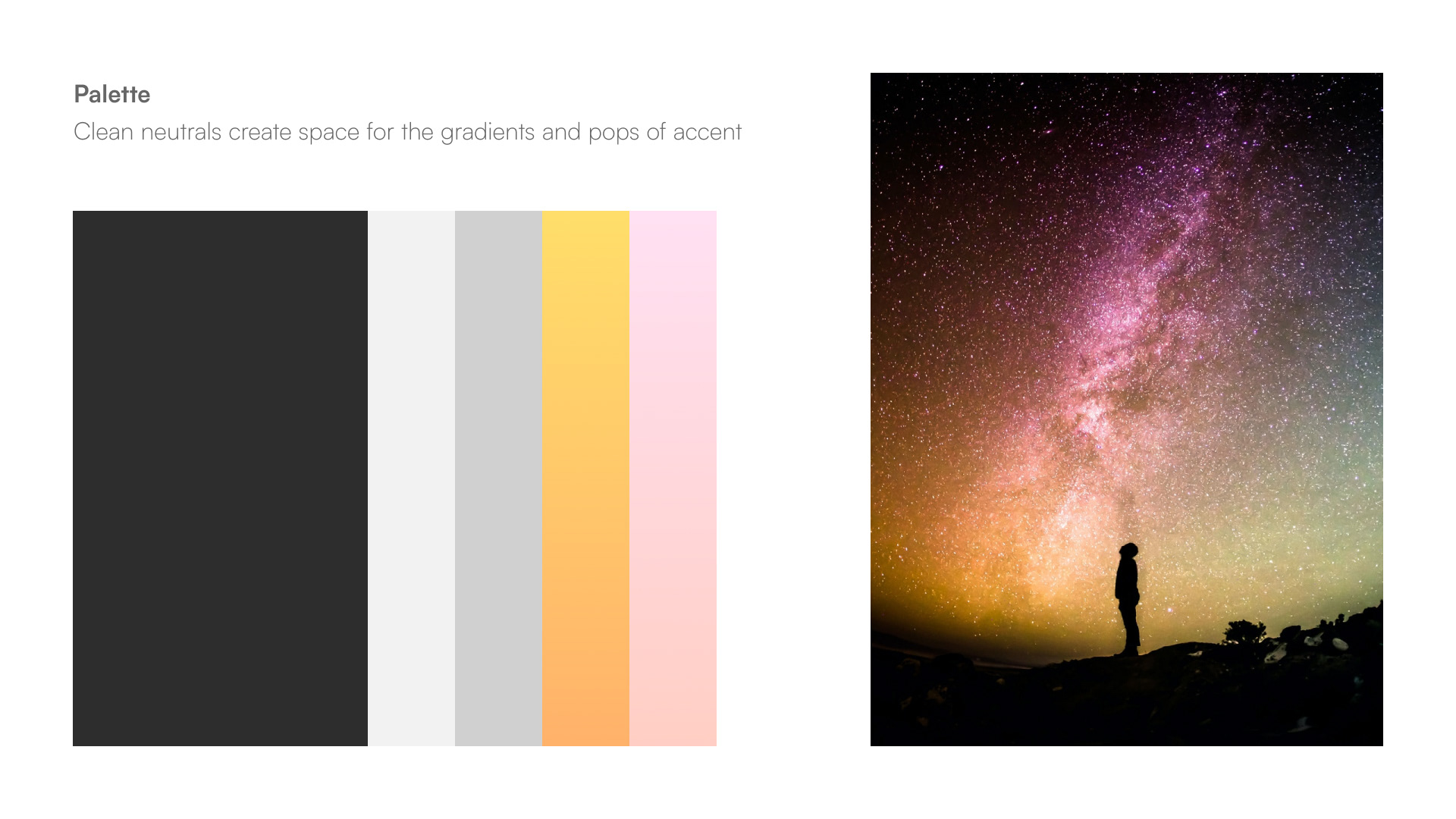
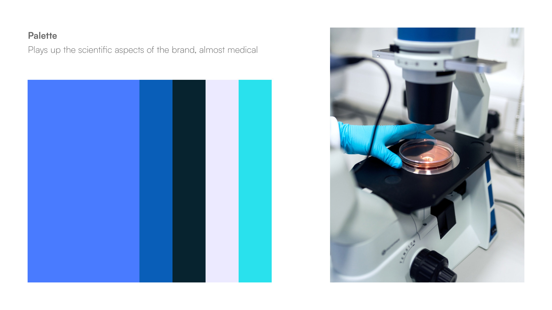
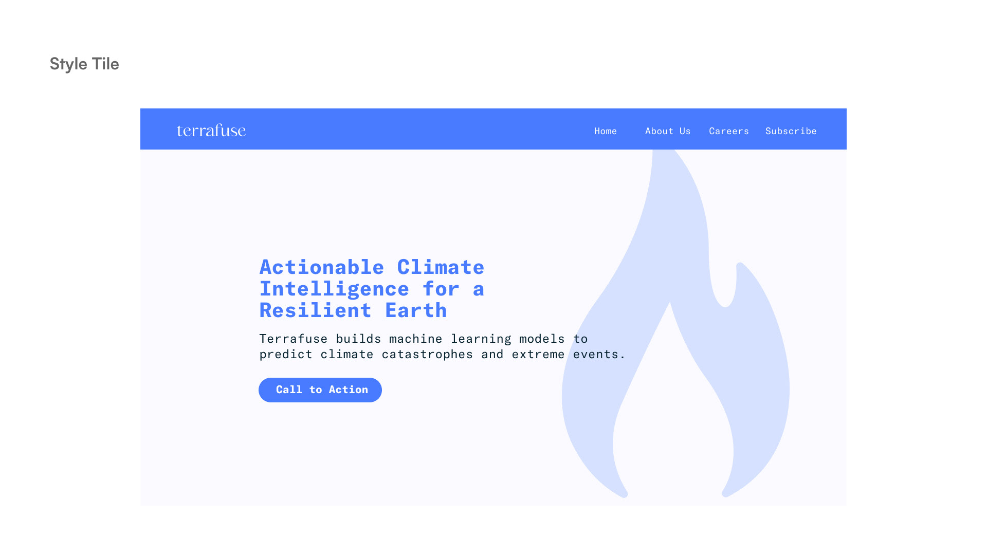
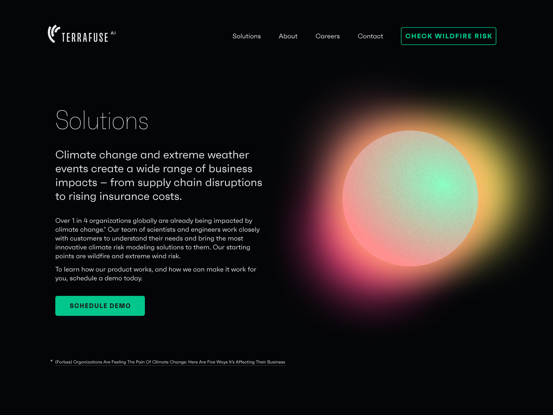
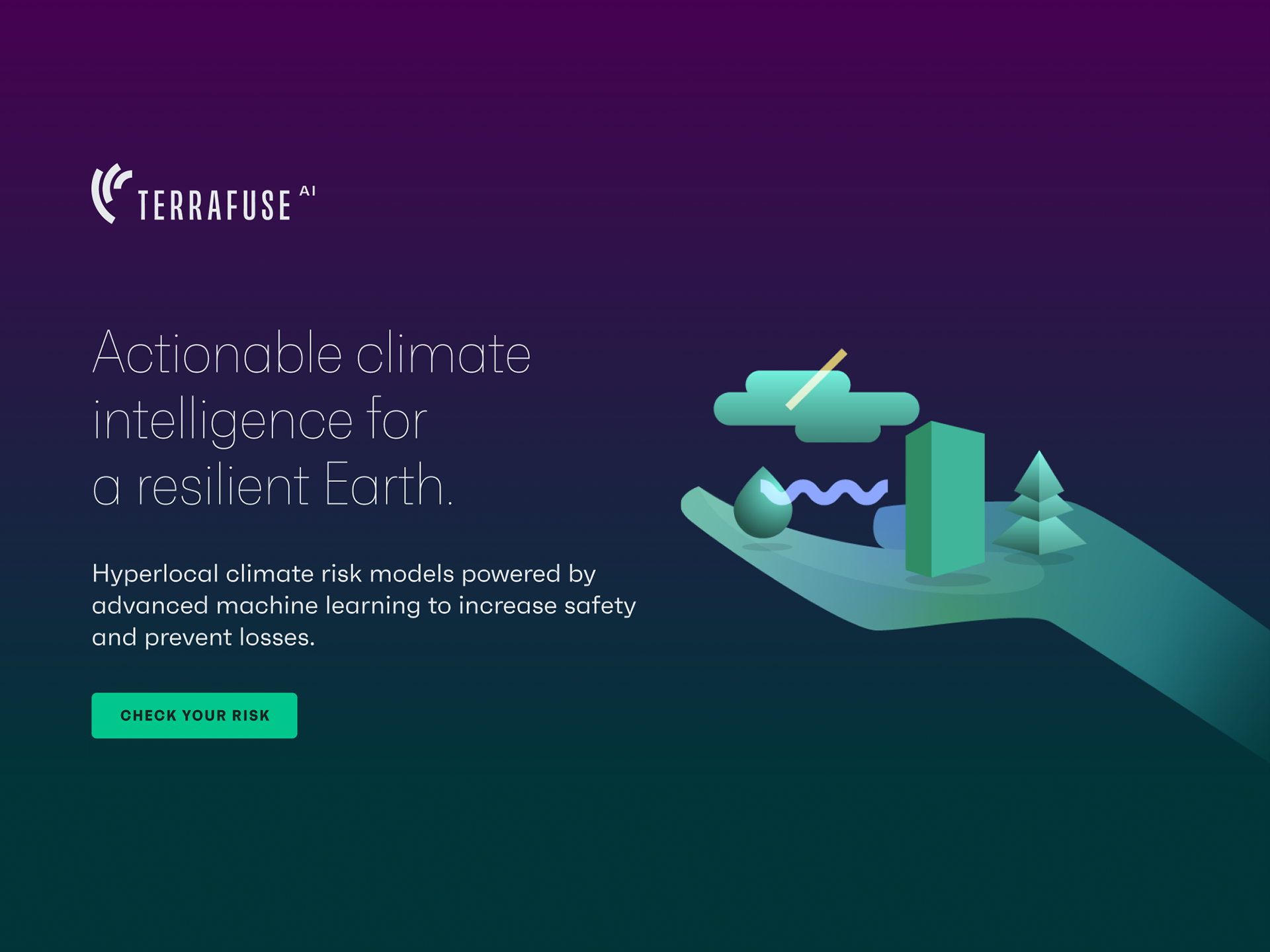
Using the findings from the discovery session, we came up with some guiding principles for the brand identity. The brand would embody a “creative scientist” persona, with science at the core but a sense of humanity and a love of nature. Rather than inundating customers with highly technical language, we would seek to demystify and help the customer understand what can be a very complex space.
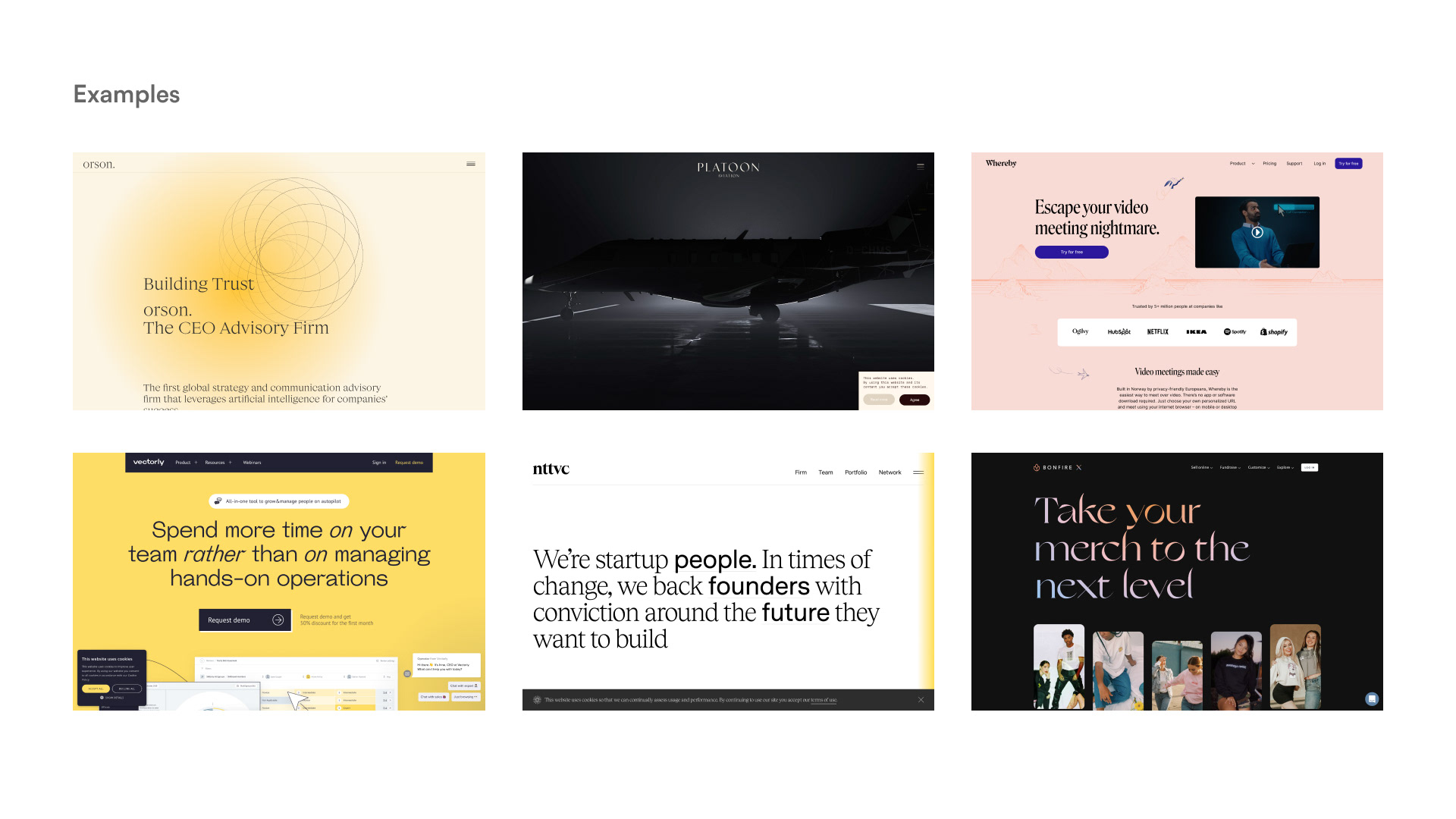
First Round
With our strategy in place, I mocked up a few rough directions to help us find our way visually. The directions were well received but there was a little tension in terms of how much we wanted to differentiate versus provide something familiar to the target audience.
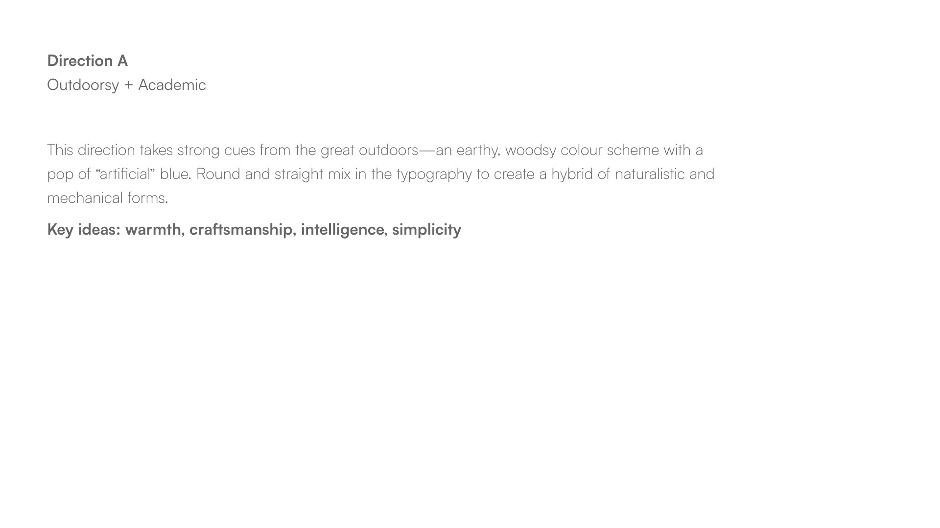
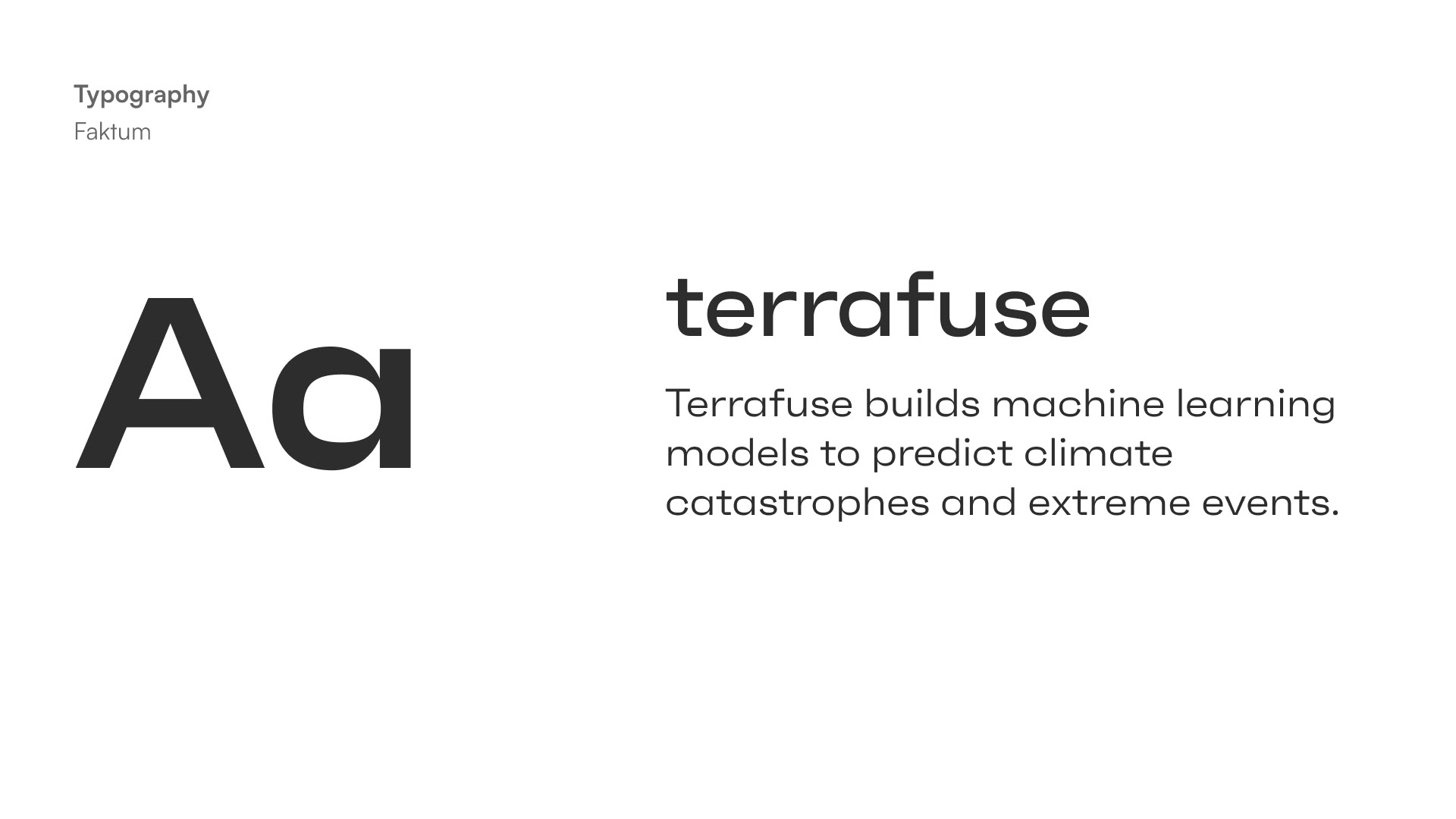
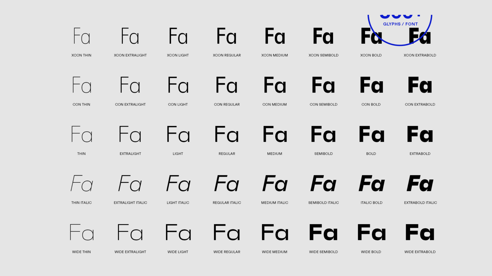

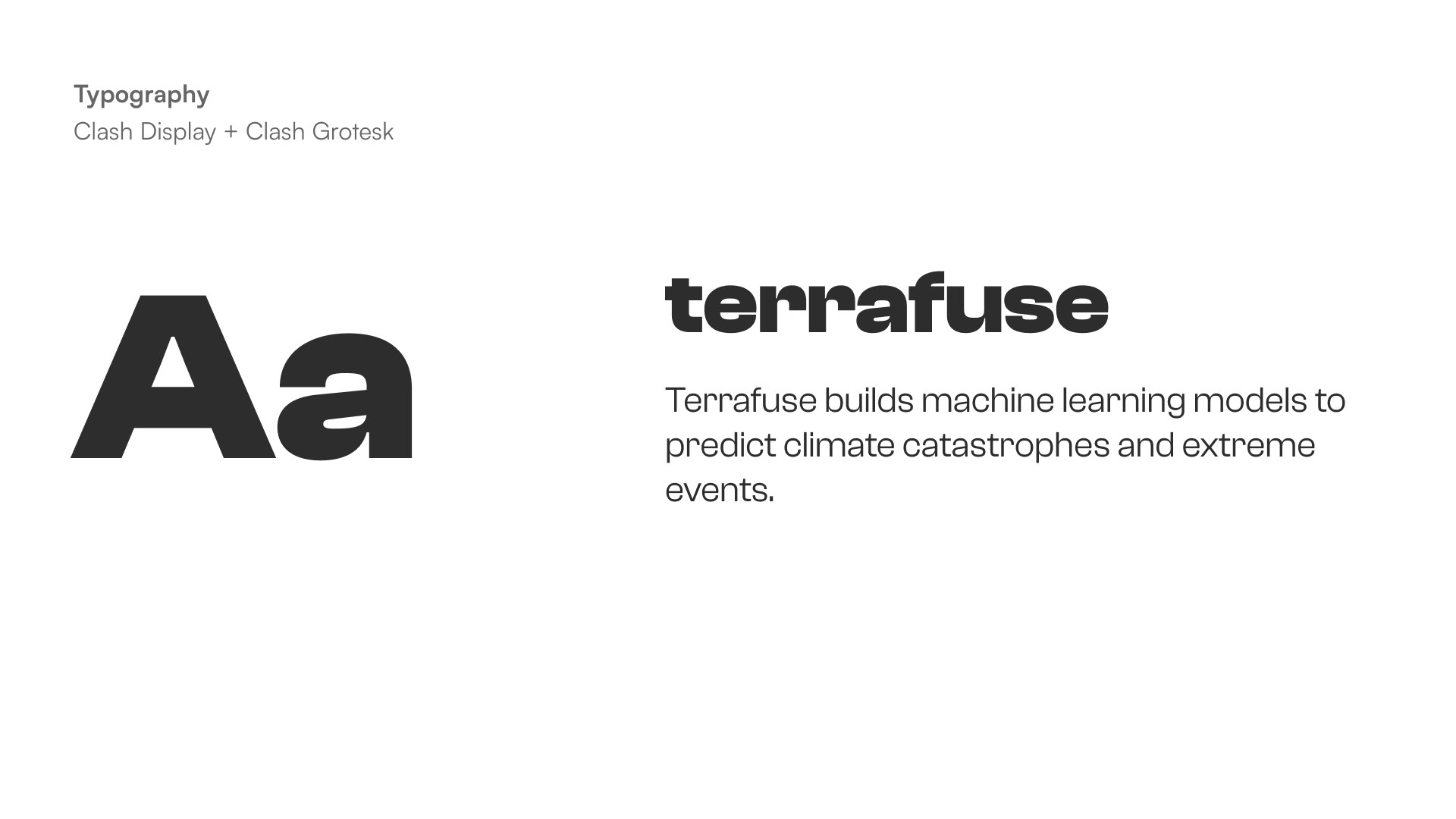


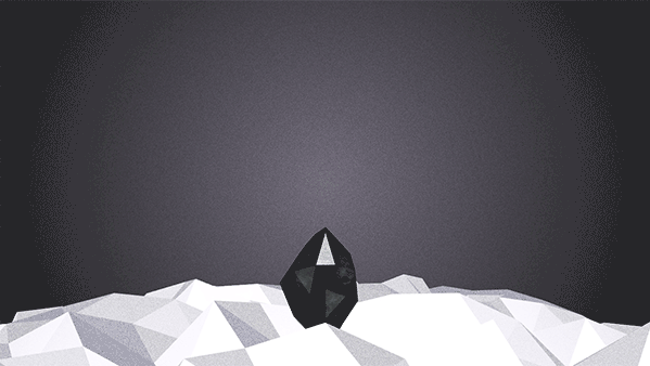
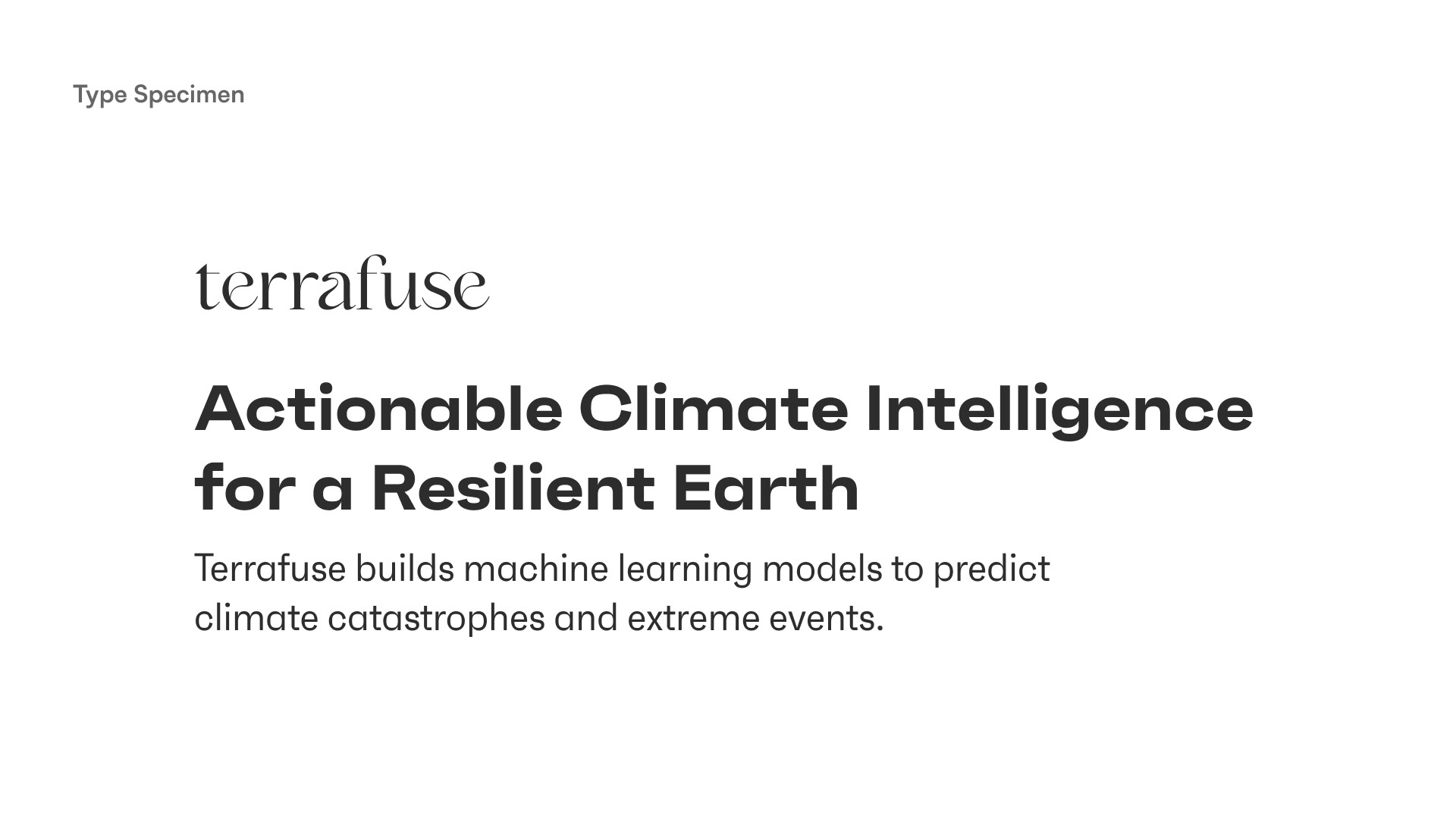
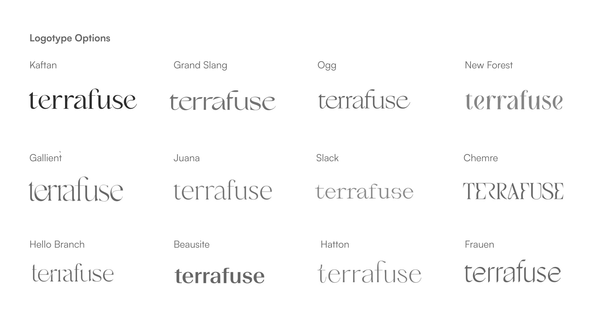
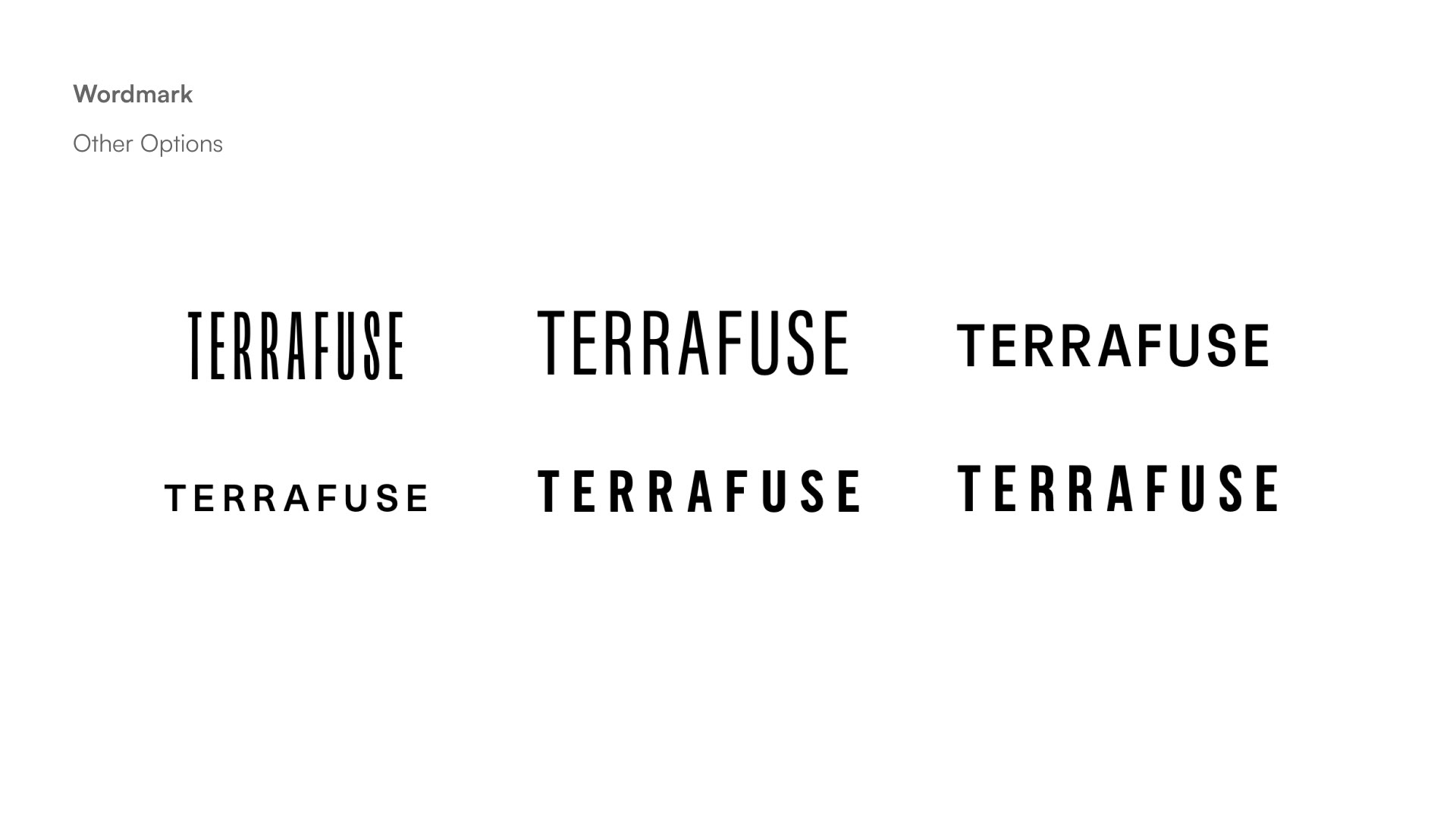
We thought the concept of a vortex was a good metaphor both for the way climate events happen and for the way AI systems pull in vast data to a centralised repository. We picked a Kaftan for the wordmark to enhance the vortexy vibes. Faktum, a typeface with contrasting square and round elements, felt like the perfect balance of scientific and humanistic properties to be the main text face.

Back to the Drawing Board
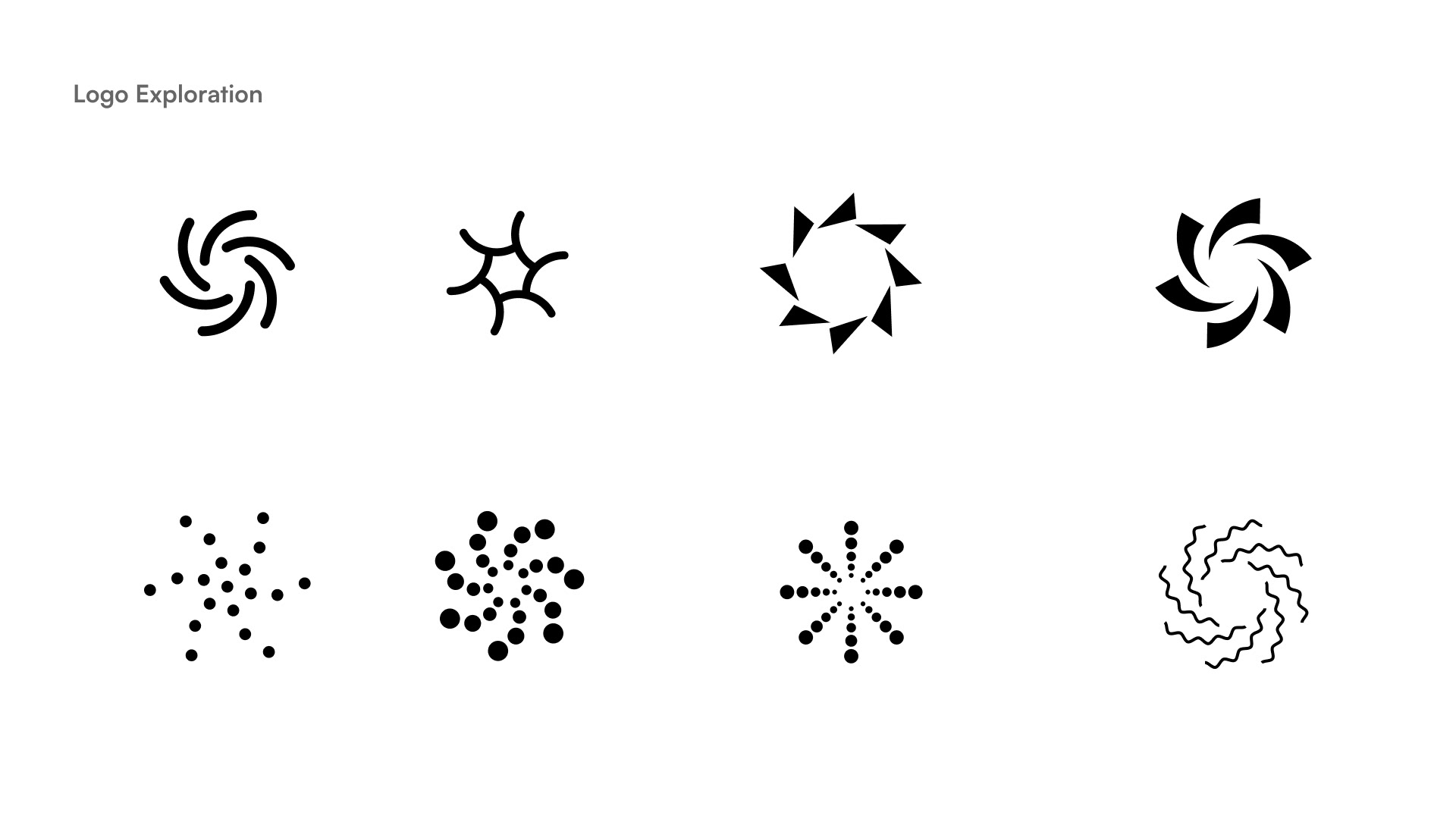
While the client liked the work being done so far, the unresolved tension over how “weird” the identity should be continued to simmer. There was a sense that, with the competition mostly using round or radial marks, we needed to move away from circles. One possible visual metaphor was the Lorenz Attractor (butterfly effect). I took this feedback and generated further concepts—both weirder and more familiar.

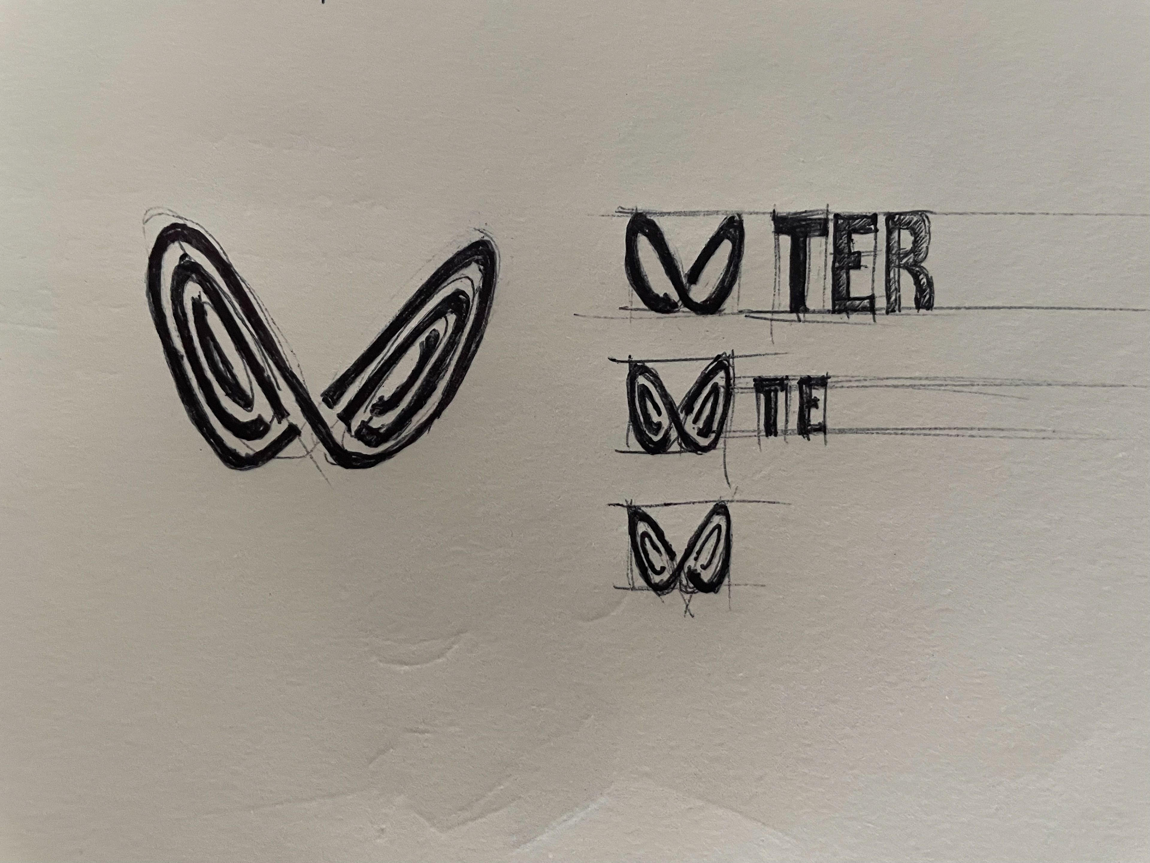
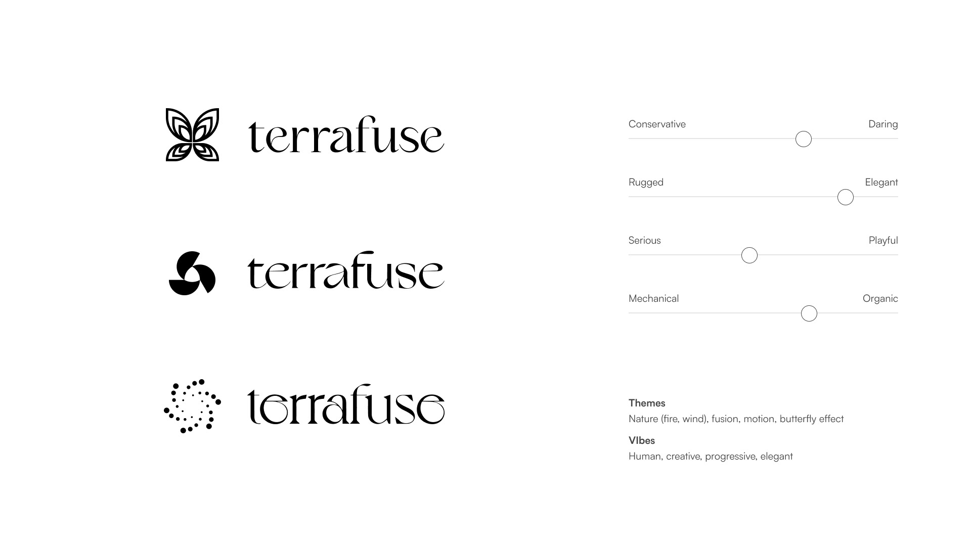
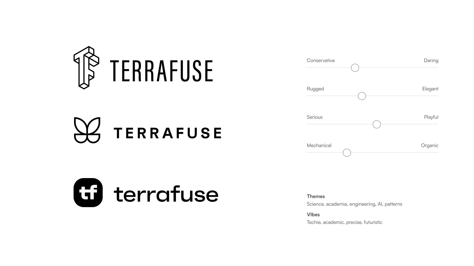
We eventually decided to go with more pared-back, sans-serif type. We liked the vortex but not round, and we liked the butterfly but not so...butterfly-esque. This was proving tough to resolve. Also, we added "AI" to the wordmark.
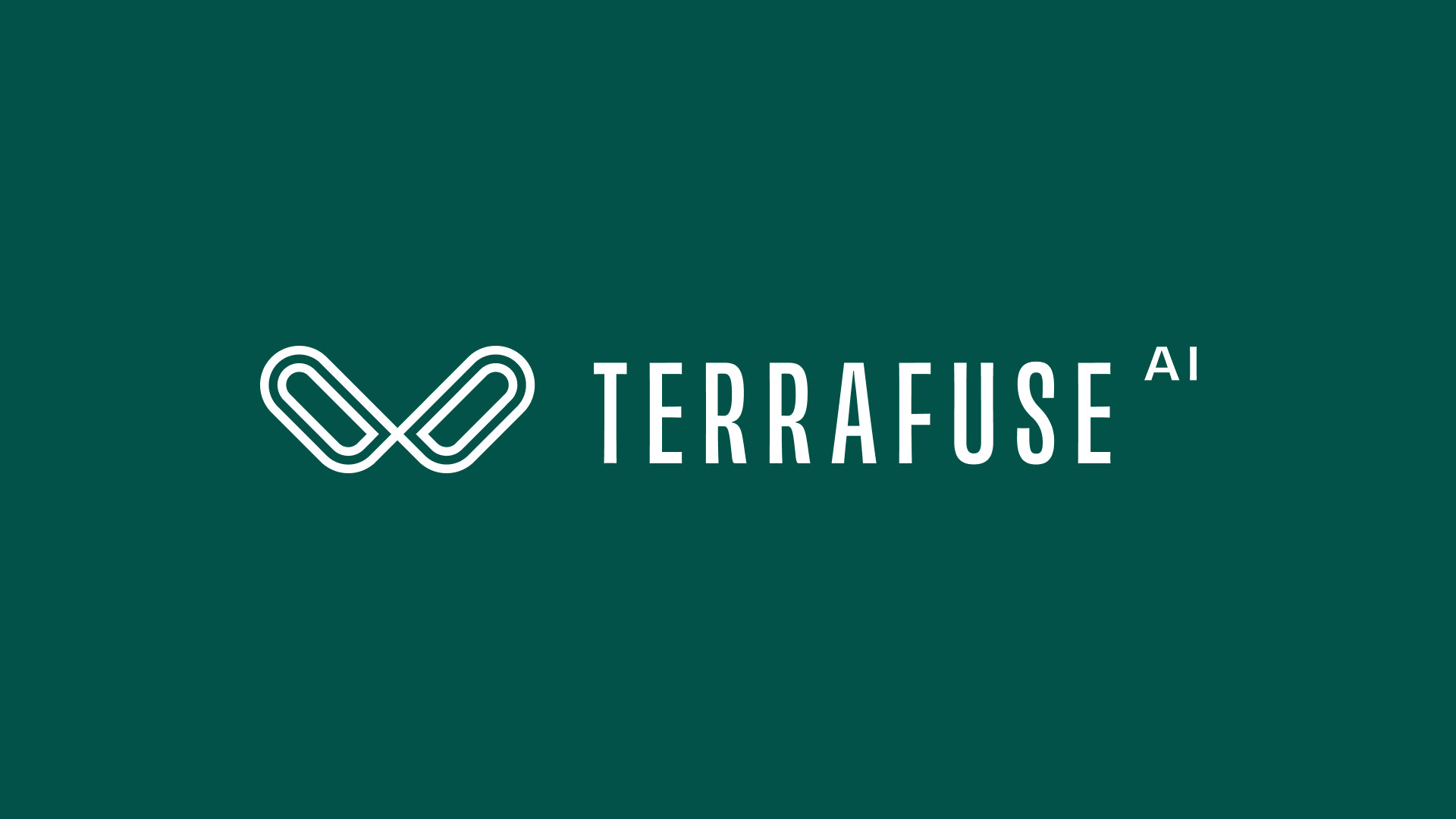
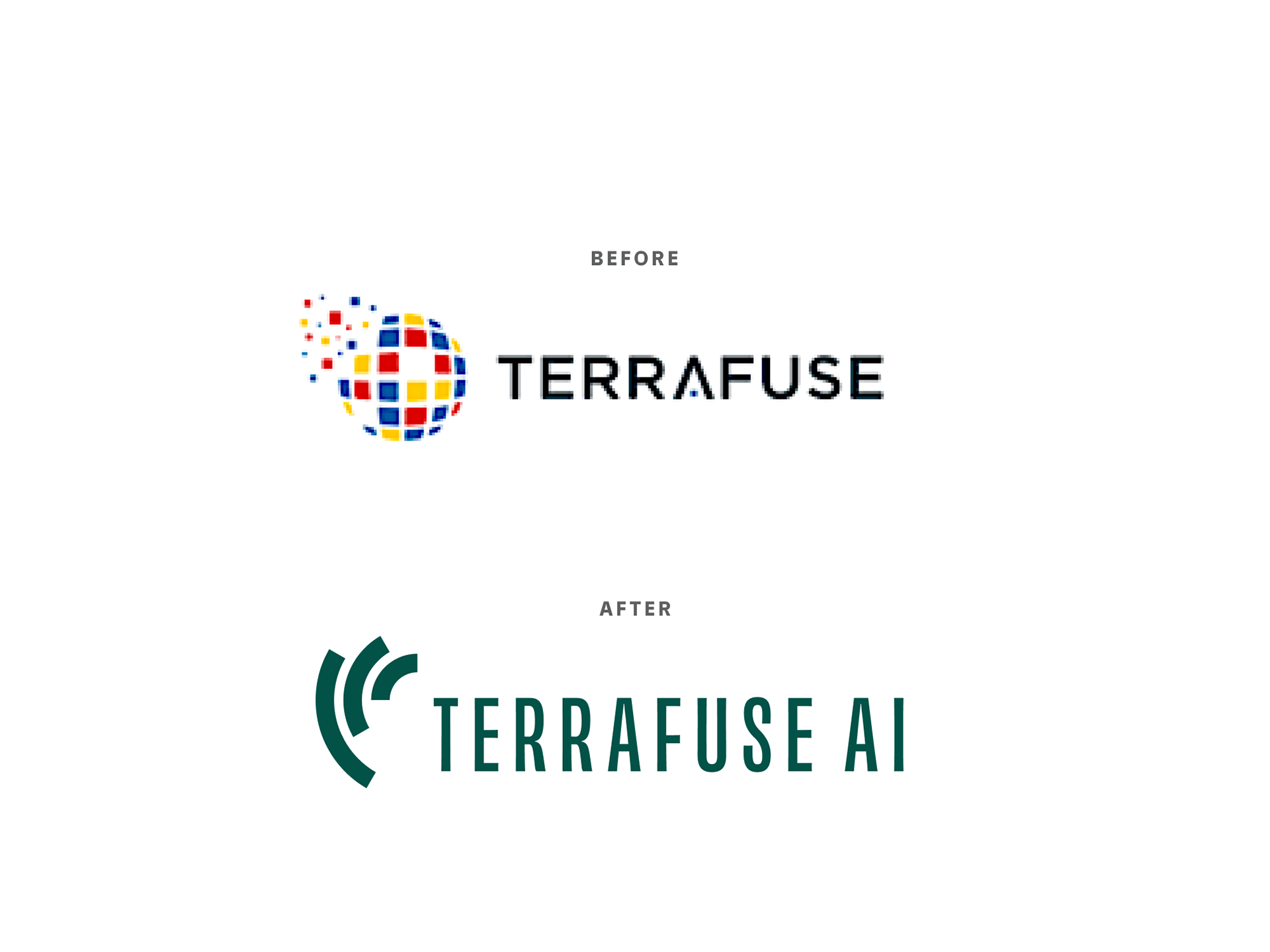
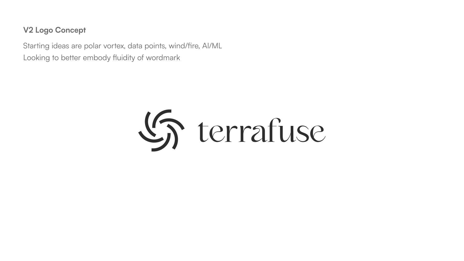
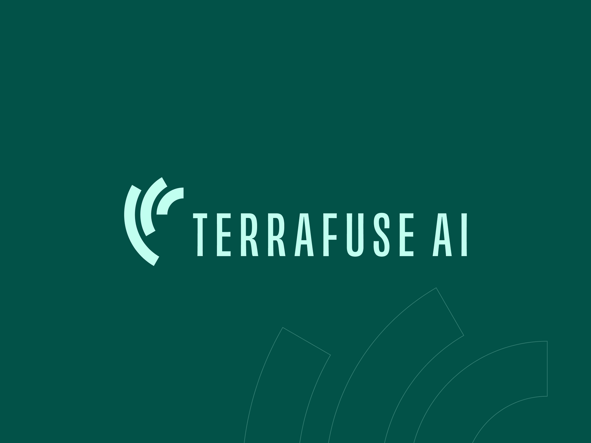
The Winner: Vortex 2.0
Coming back to the vortex idea, I was able to simplify the idea of convergence down to 3 arcs without losing too much of the energy from the radial versions. We felt this paired nicely with the newer, more buttoned-up type.


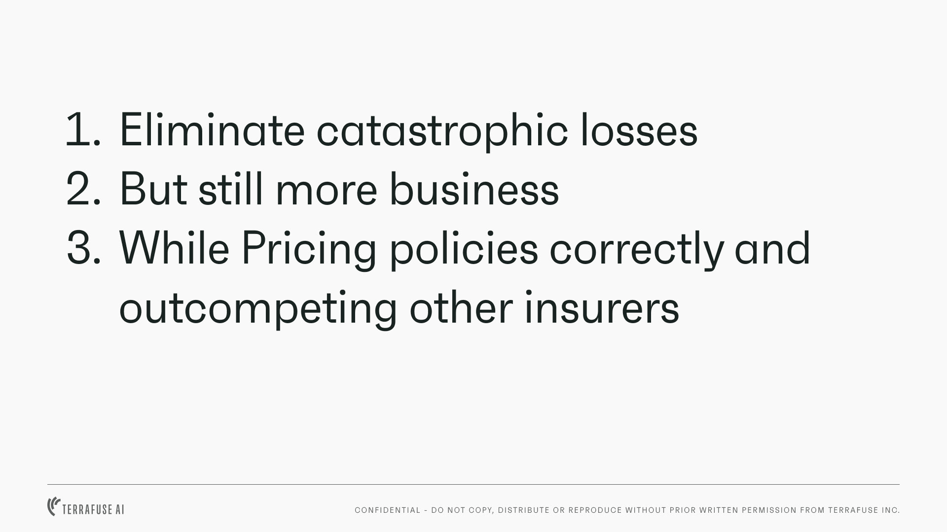
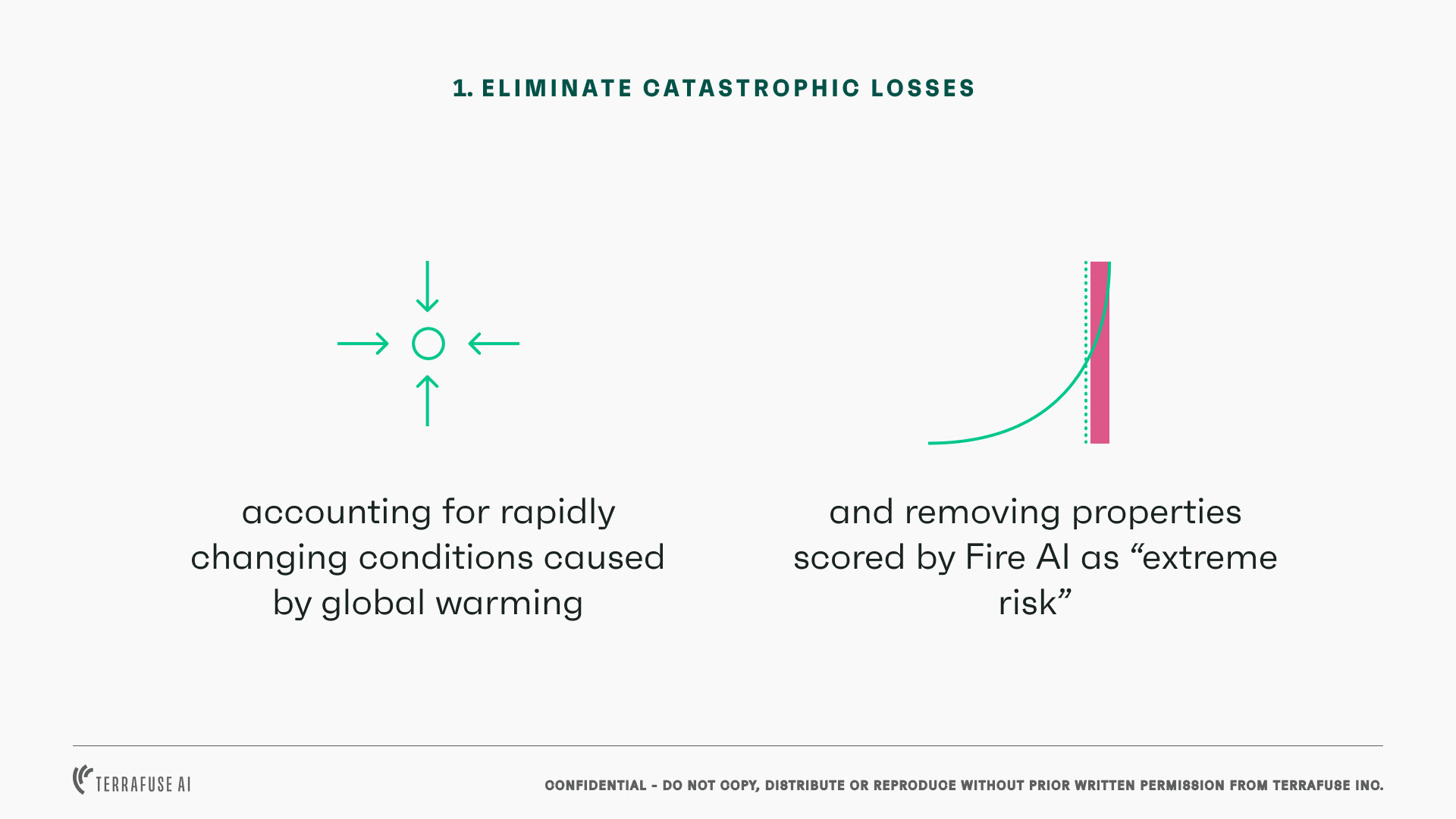
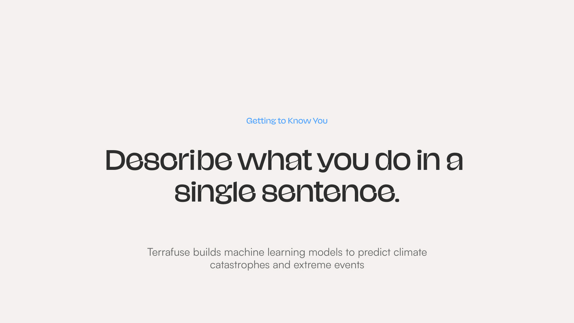
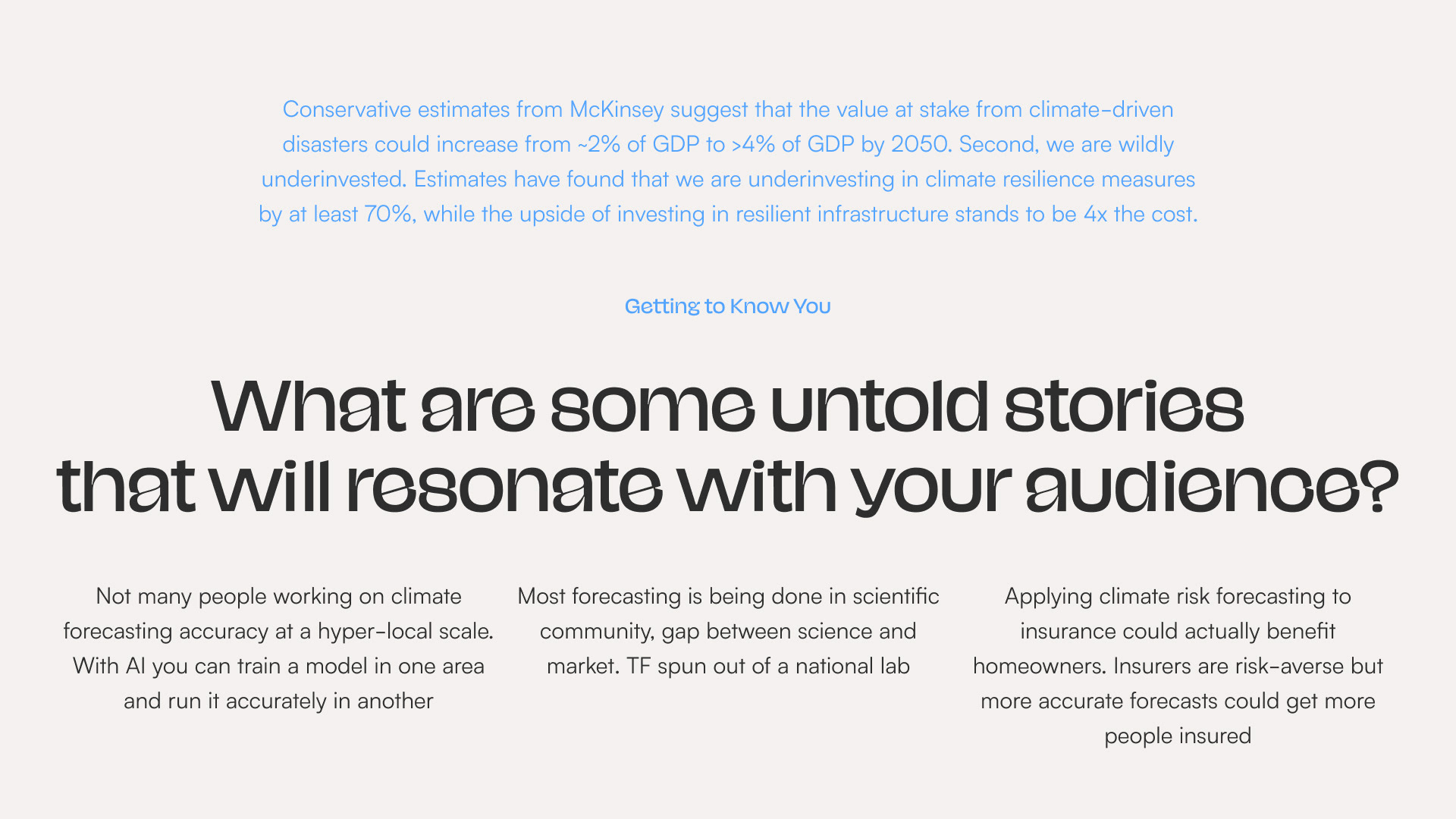
Presentation template