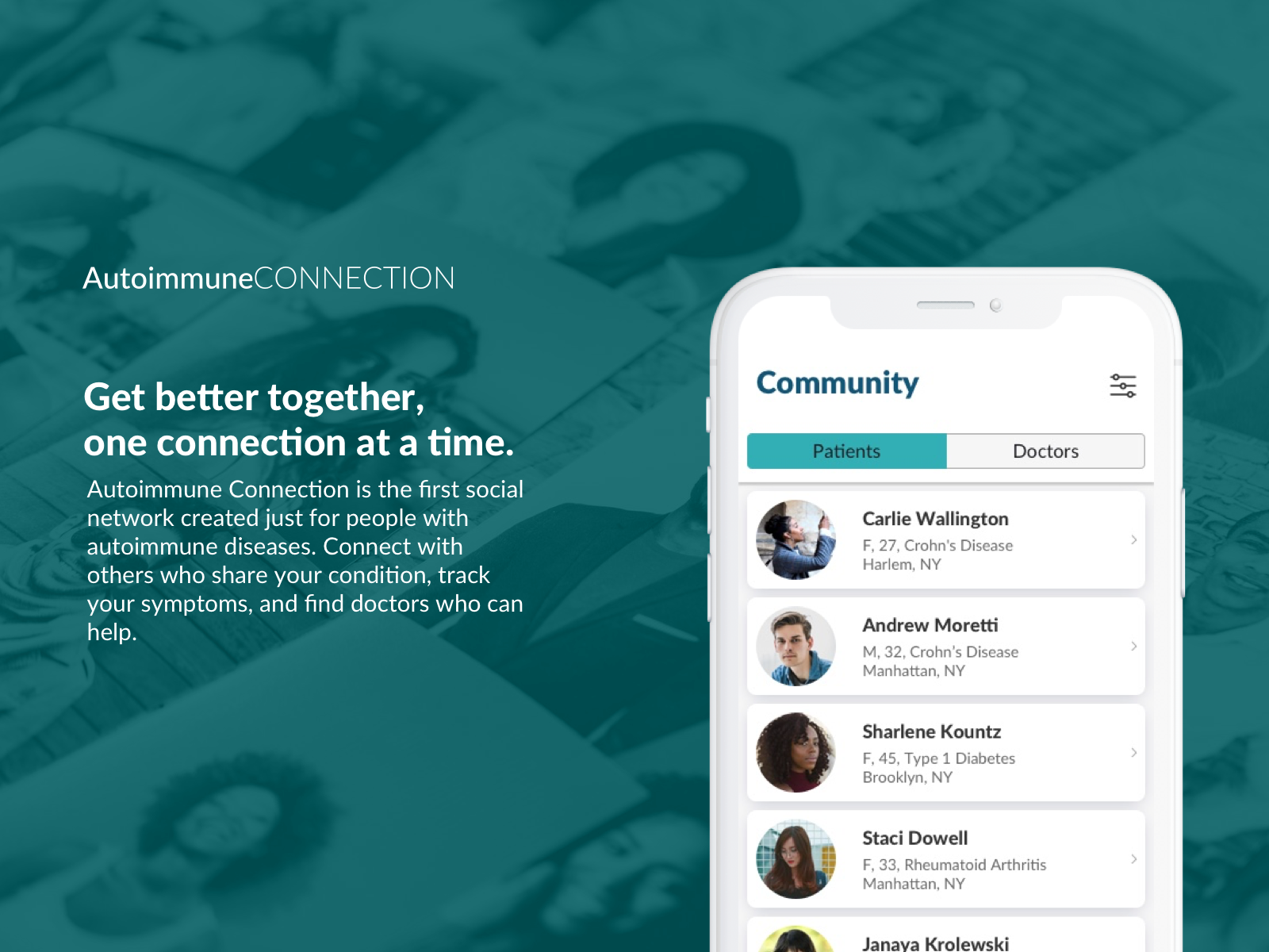
Autoimmune Connection is a social network and health tracker created for people living with autoimmune diseases. I worked with the founder with the goal of helping her secure initial funding to build the first version of the product, as well develop an initial community around the app. We built an app prototype, landing page, and multiple research tools including surveys and usability tests.
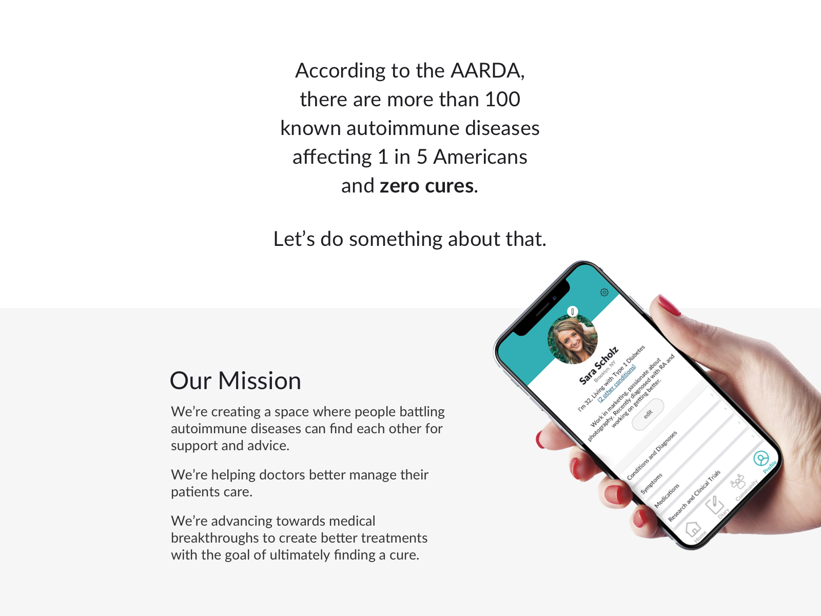
The experience of dealing with autoimmune conditions can be incredibly frustrating. About 25% of people who have one autoimmune disease will have another one. In addition, treatments work differently for different people. This leads to a situation where patients are often seeing multiple healthcare professionals, conducting their own research and jumping in and out of online discussion groups to find information. There is more money spent on autoimmune conditions in the US than cancer or heart disease, yet there are no true cures.
The founder, who works in the Pharmaceutical industry and has dealt with multiple autoimmune diseases herself, envisioned a solution that would allow people to better manage their conditions and connect with others dealing with similar issues.
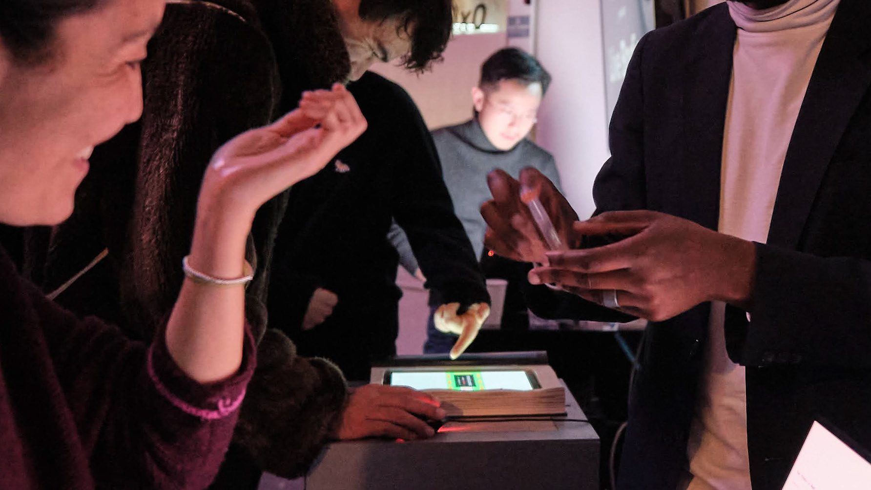
Walkthrough video created for usability testing group.
Product Strategy and Roadmap
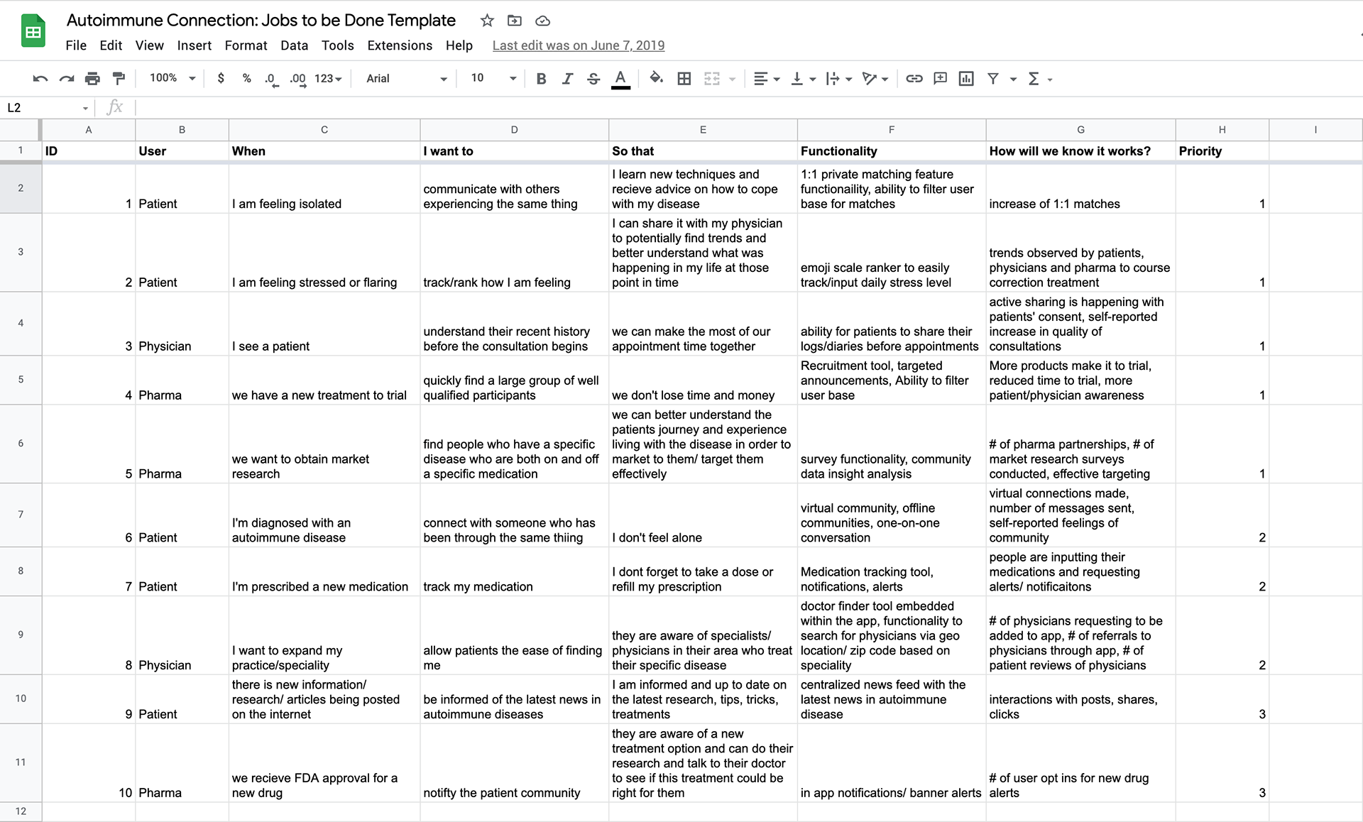
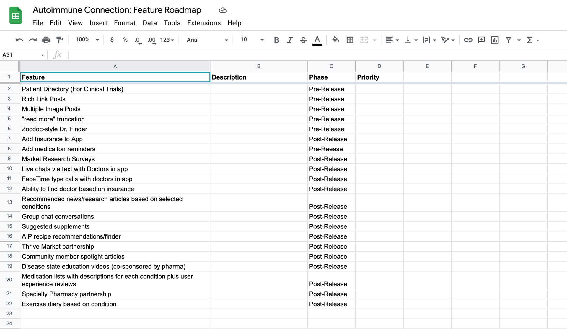
Using the Jobs to Be Done framework, we identified core product features from the client's existing research and placed them on a development timeline. We then decided which ones required validation in later user tests so we could include them in the prototype.
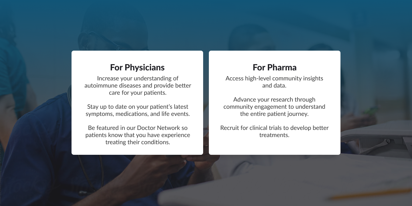
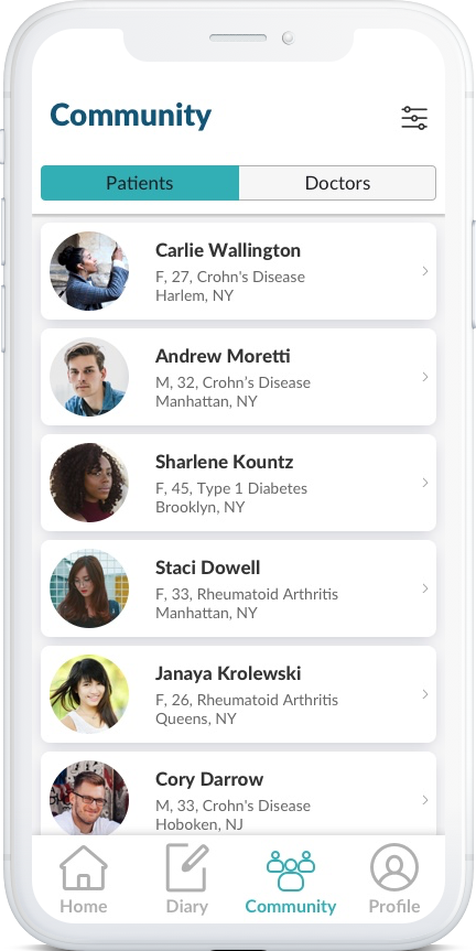
We identified three stakeholders: patients, physicians and pharmaceutical companies. Each group had their own objectives and priorities.
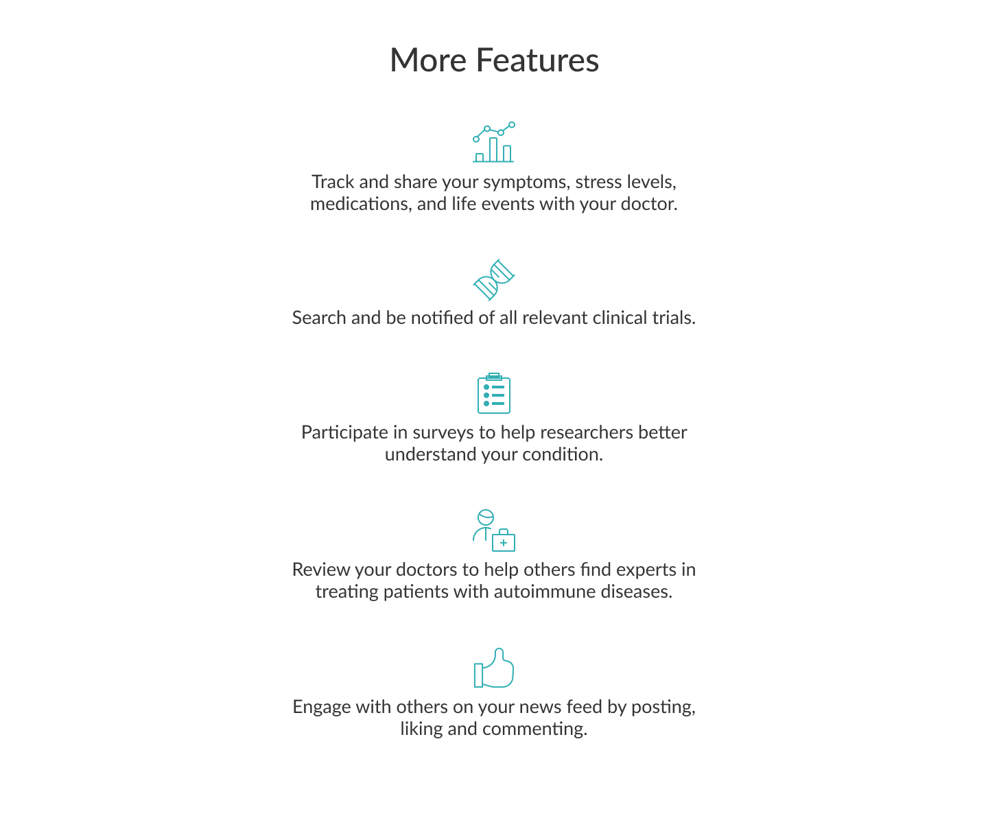
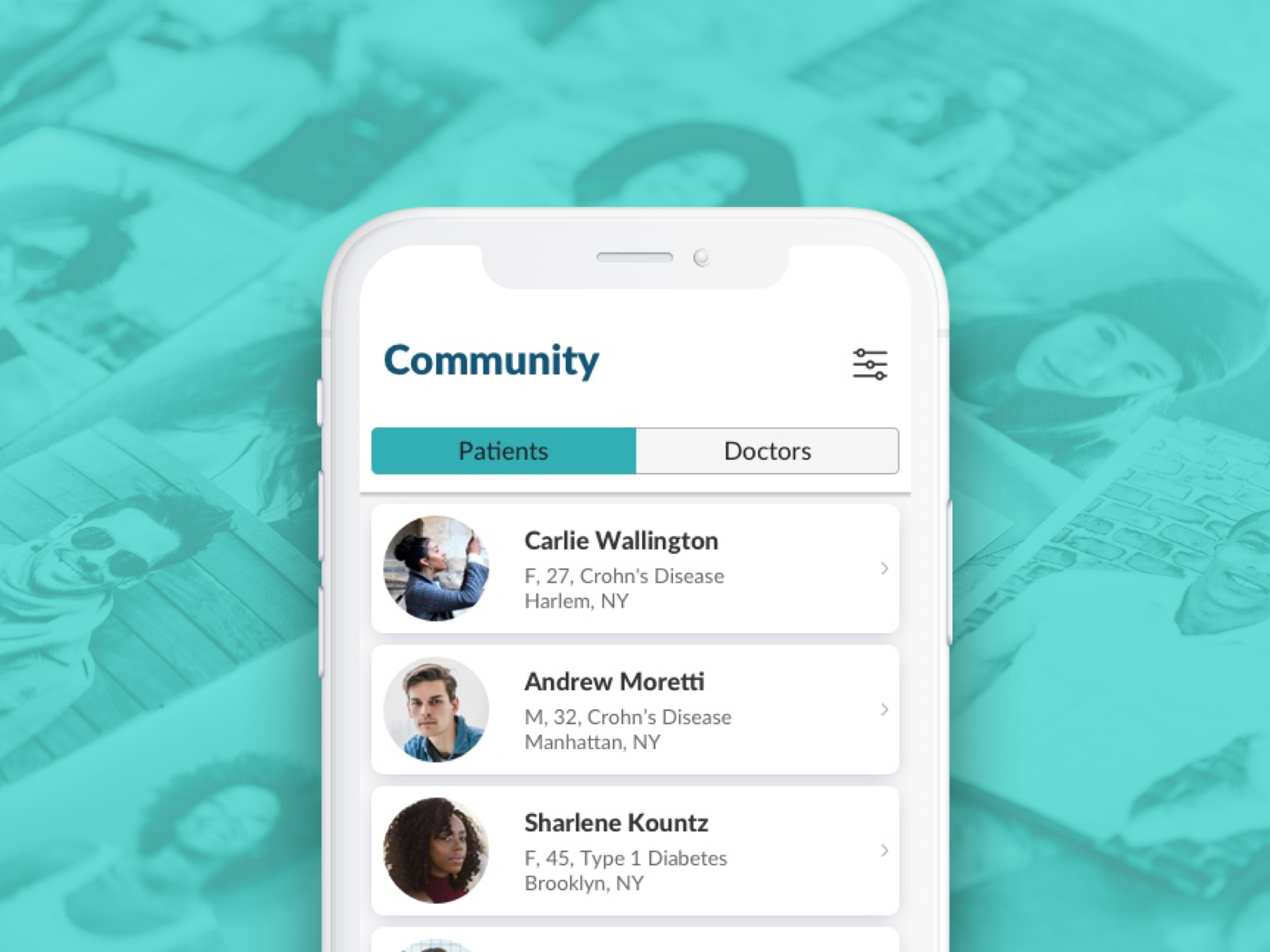
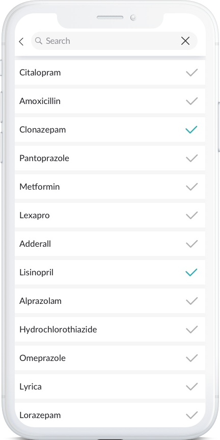
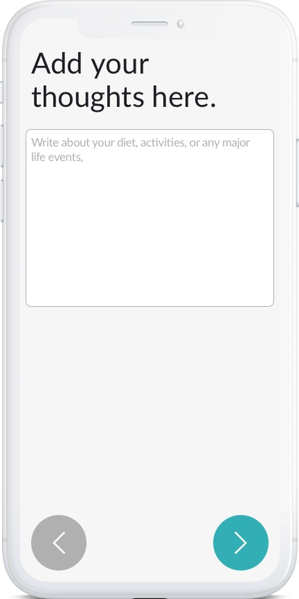
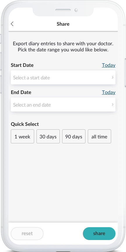
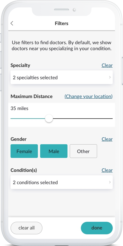
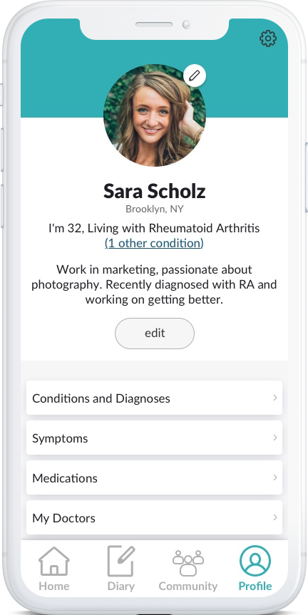
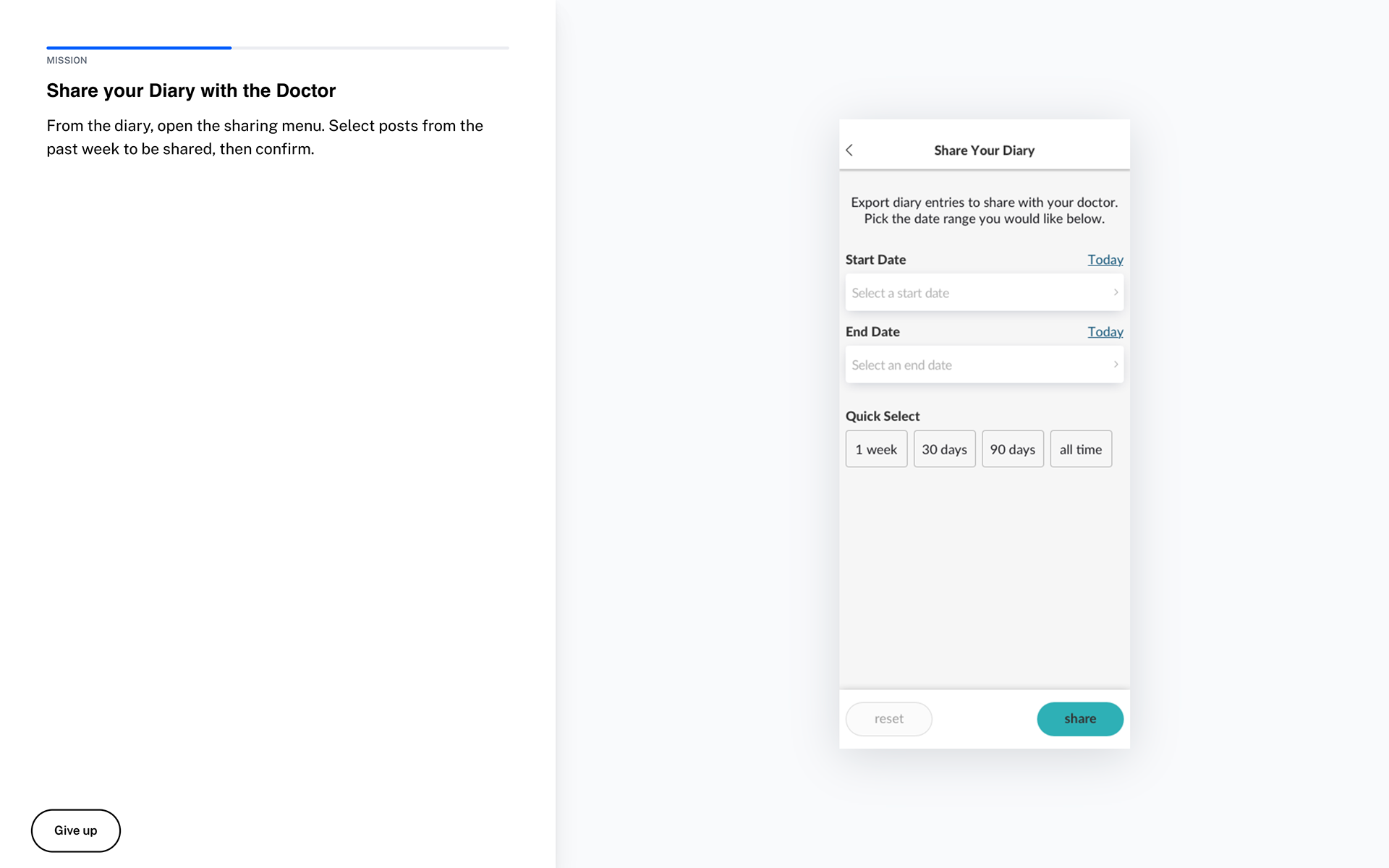
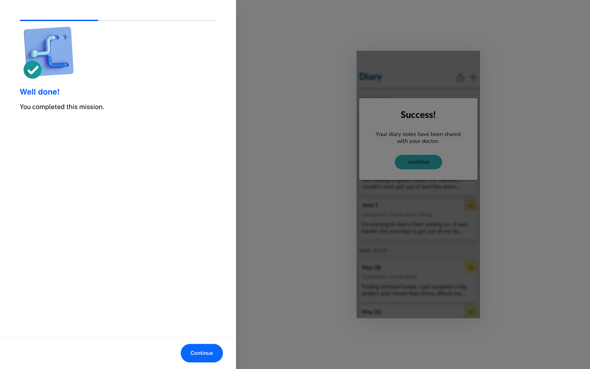
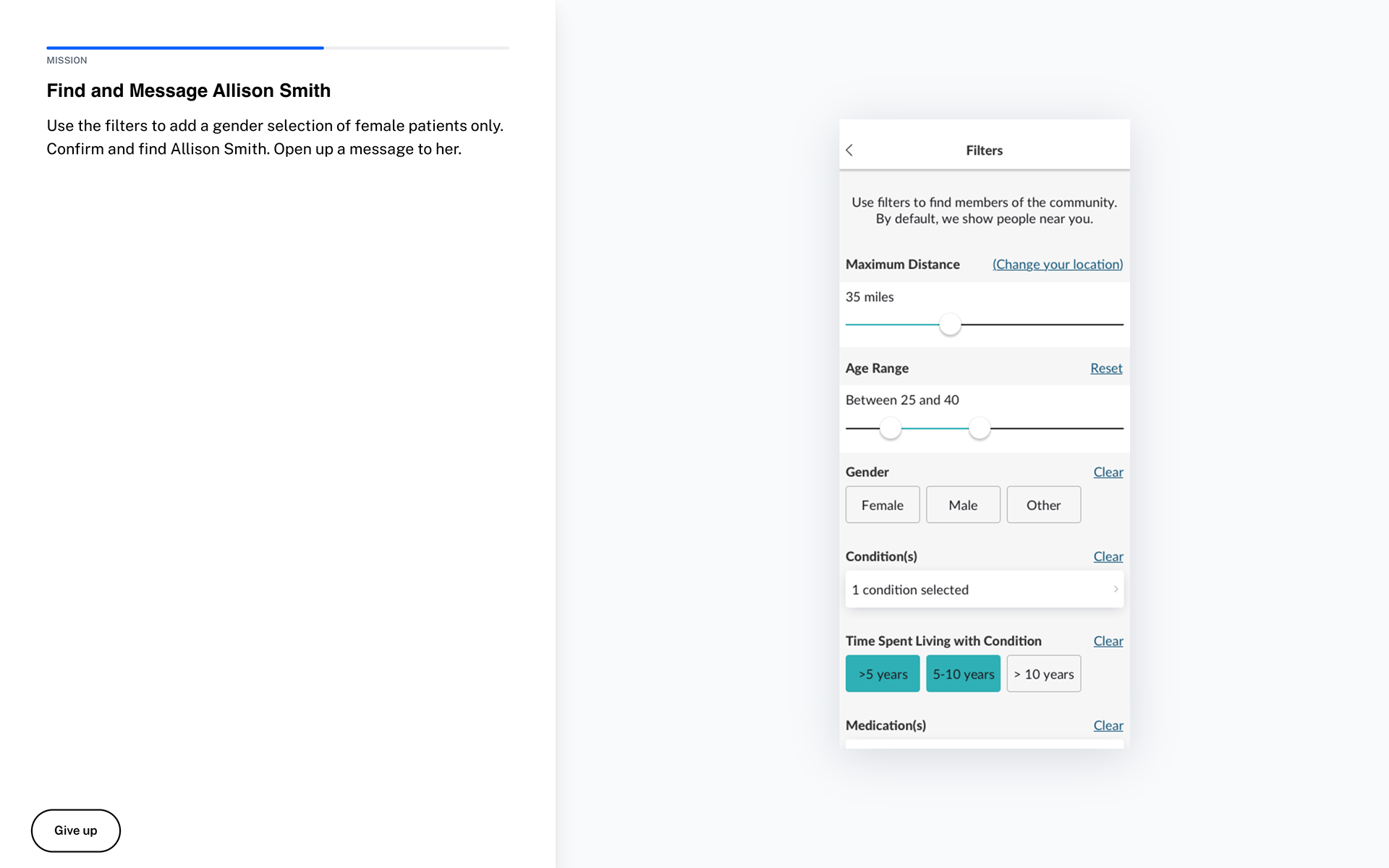
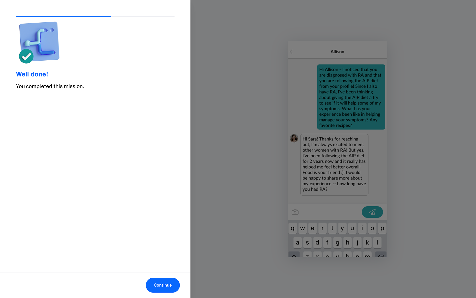
Patients wanted to find experienced doctors and effective treatments for their conditions. They wanted to connect with others going through similar situations and discuss ways to manage them. They needed help keeping track of medications, flareups and symptoms.
Physicians wanted to better identify patterns with their patients over time, as well as between many patients with similar symptoms. They wanted a way to reach more people dealing with issues in their area of specialisation.
Pharmaceutical companies wanted a simple transparent way to reach audiences for research and trials, as well as get the word out on approved medications.
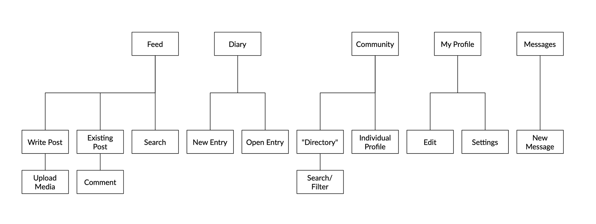
Information Architecture
As the client had many feature ideas, we needed to sort and organise them in a way that would be manageable for people using the app. It was important to balance the expectations of the target audience (based on what products they used most frequently) with a structure that would allow them to eventually become "power users".
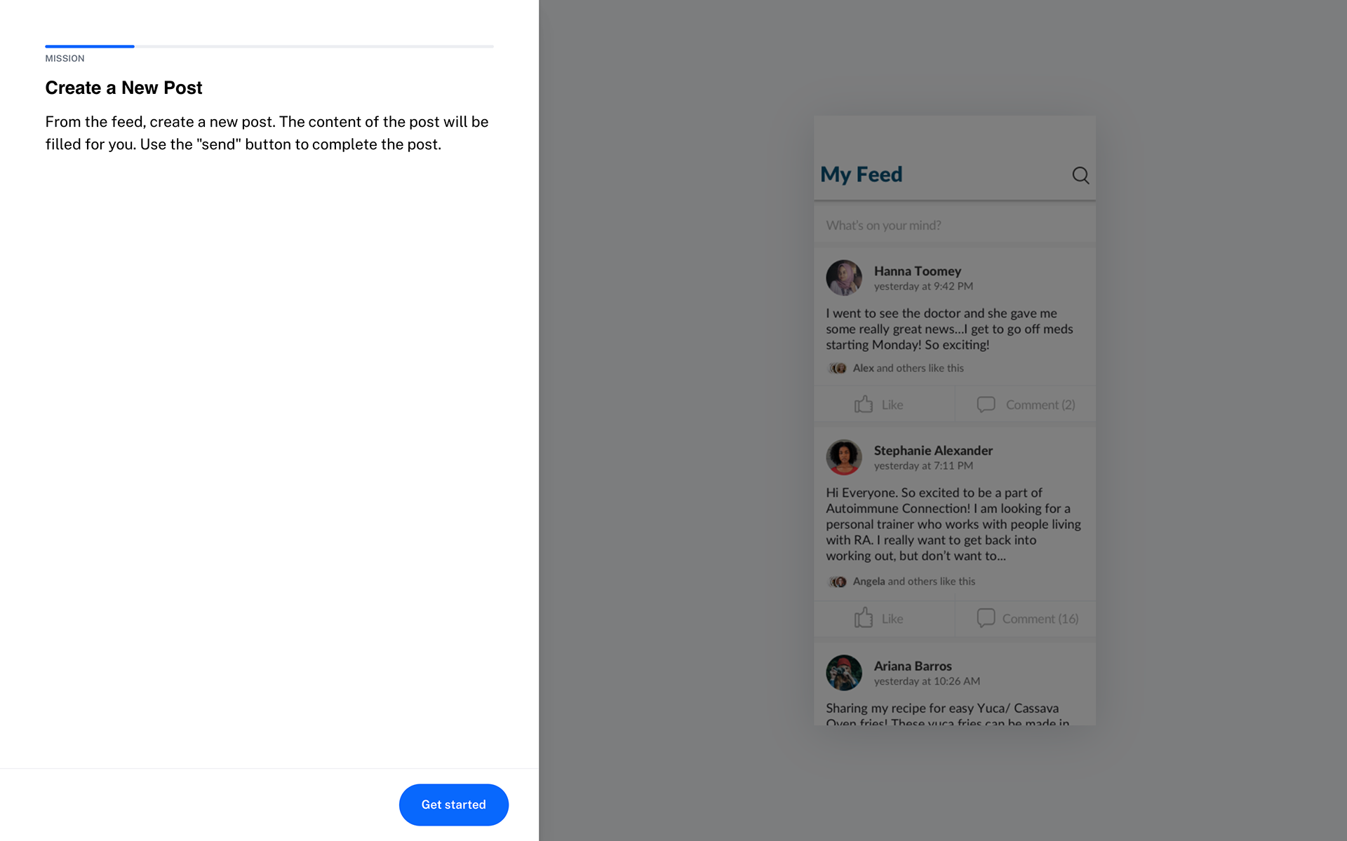
In our validation surveys, three archetypes emerged (with overlap between the three). Some people mostly wanted to use the feed and posting features, effectively using the app as a specialised Twitter. Others were more interested in connecting with people one-on-one via the directory and messaging. Finally, there was a group that planned to use the app primarily to track their symptoms.
Interface Design
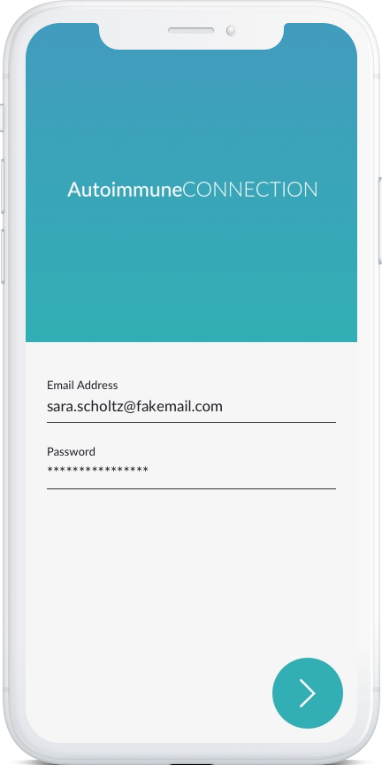
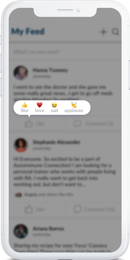
Starting with wireframes, I built out the main app screens with Adobe XD. You can see a very janky clickable prototype here. At this stage, I use this asset as a discussion tool with the client to act out the various decisions we want to make.
For example, we looked at a few different ways for people to react to posts and ultimately opted for a Facebook-style emote response versus a simple like or upvote. This is to do with the complex, often emotion nature of posts we expected the community would share.
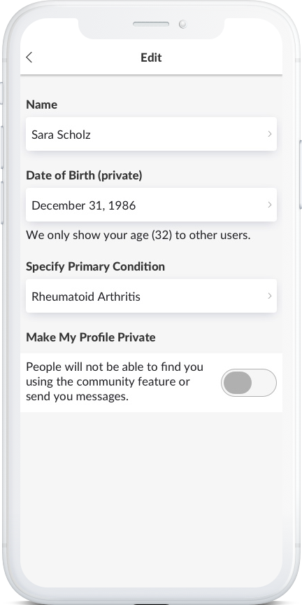
Working with brand guidelines from a previous designer, I expanded the visual identity to work in web and mobile contexts, building out a lightweight design system. This allowed me to quickly build out all the screens required and create a clickable prototype.
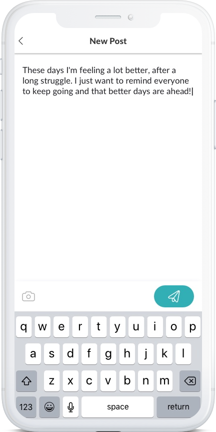
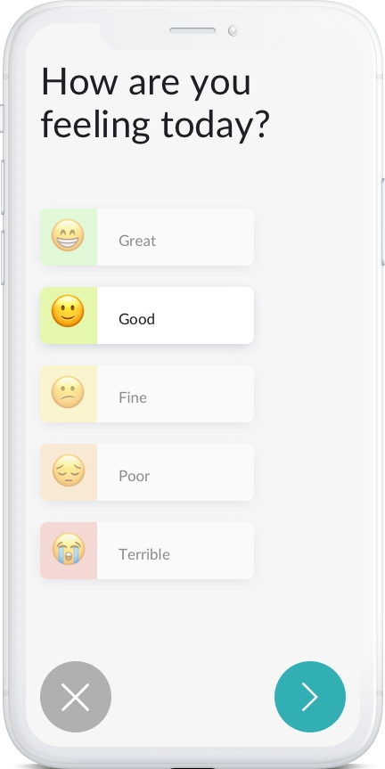
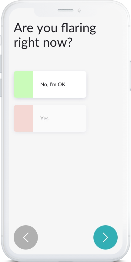
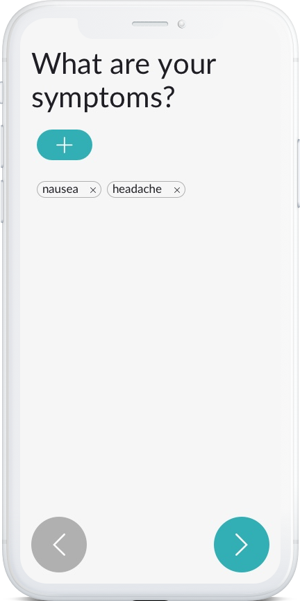
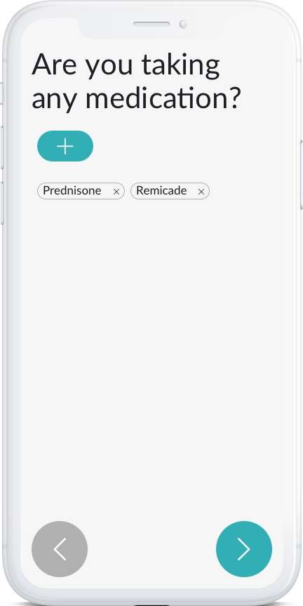
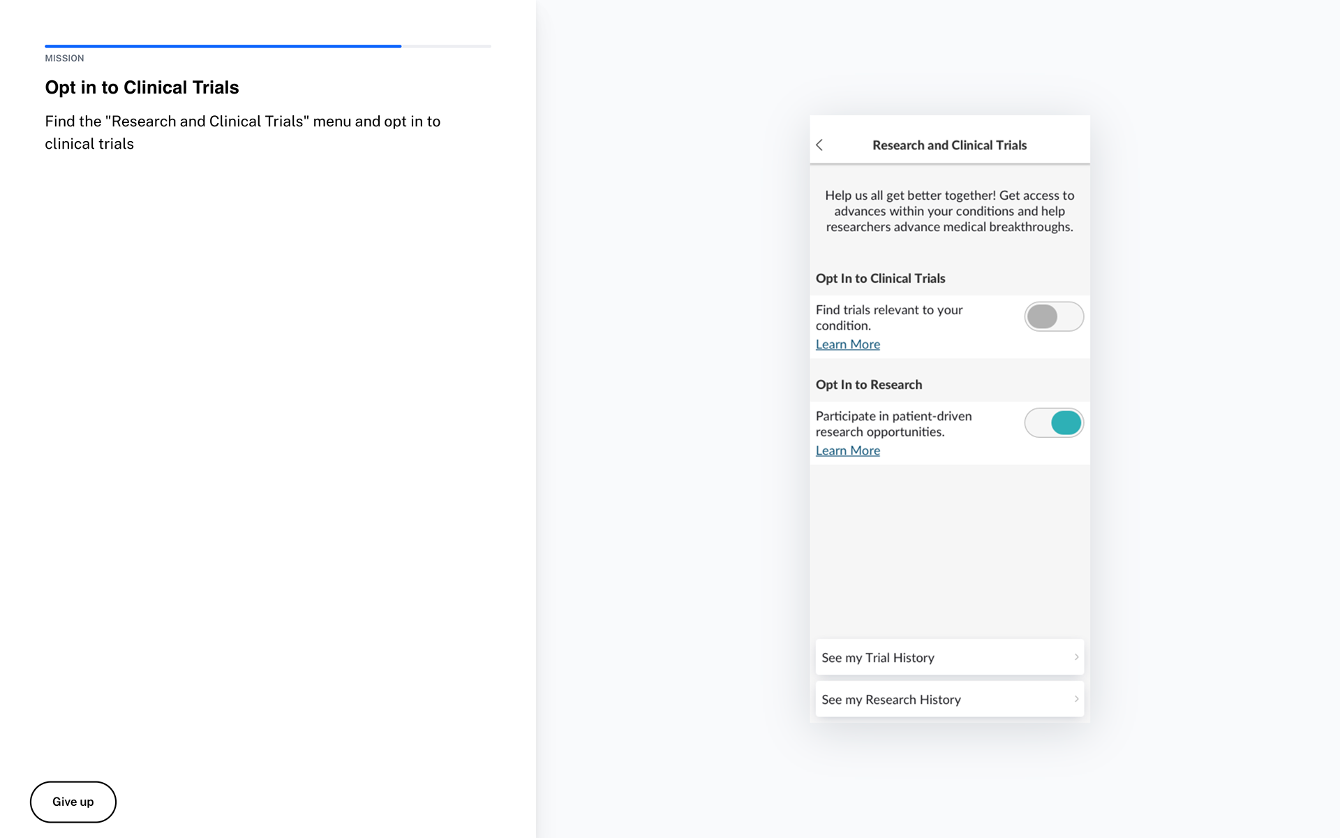
I used Maze to create a series of activity completion tests to see how people would go about accomplishing tasks like creating posts, adding entries to their journal, finding physicians or opting in for clinical trials. While almost everybody was able to complete the tasks, they didn't always take the path I would have imagined to get there. A valuable reminder to build roads that allow people to take the scenic route sometimes.
Landing Page
I helped the founder restructure and rewrite her existing landing page for maximum impact and with the revised goal of capturing pre-launch signups. We focused on communicating AIC's mission and benefits. We also wanted to create a feeling of collective action on the part of the entire community.