In 2010, Zev Moses walked past a building in his Plateau Mont-Royal neighbourhood that looked distinctly like an old synagogue. Looking it up online, he was surprised to find there was no information available on the building’s history. Thus begin a passion project, half Google Maps, half 23 and Me. Zev’s aim was to create an online archive of Jewish heritage sites in Montreal.
Fast forward to 2014, and the project—now known as the Interactive Museum of Jewish Montreal—had expanded to include walking tours, pop-up exhibits and special projects, including food programming (Montreal’s bagels and smoked meat are the stuff of legend). Employing a full-time team as well as student fellows, the museum was starting to feel growing pains.
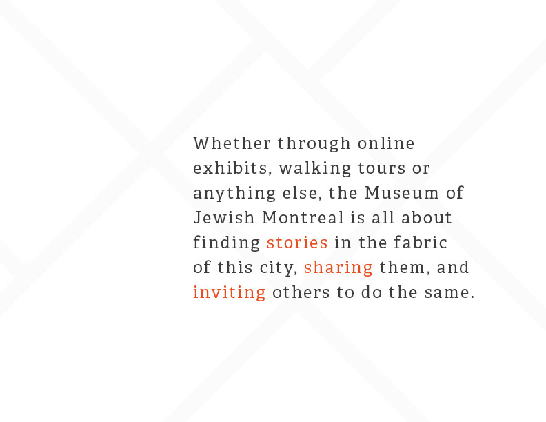
The founder had designed the existing identity himself and was looking for professional help to create something that outlined their values (co-authorship, storytelling, exploration), created a sense of purpose and pride internally, and positioned them for the journey ahead. Funders, visitors and staff were equally important, and all had to be considered.
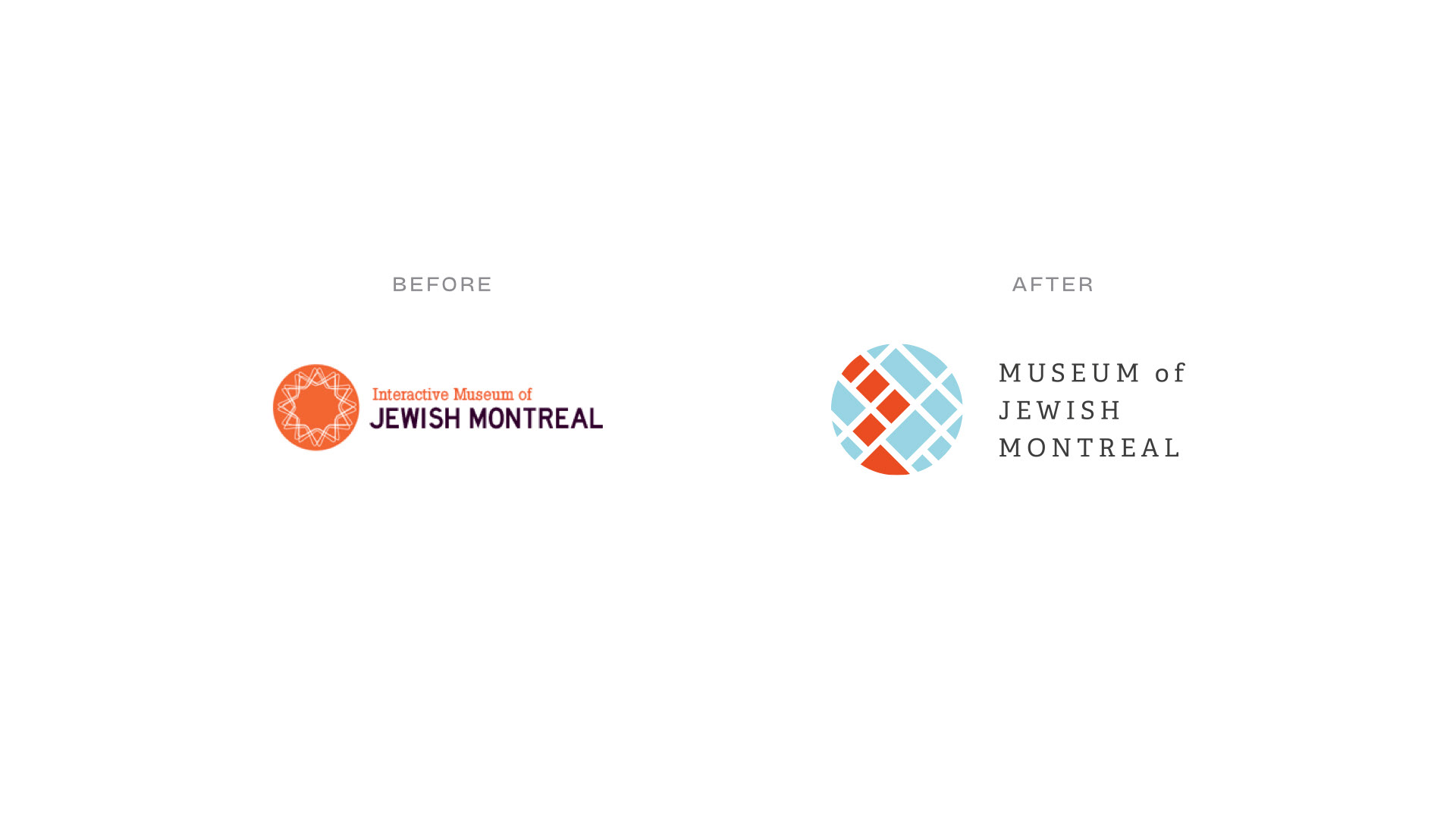
We felt the museum had outgrown its online-only roots and had both feet firmly planted in the streets of the city. We decided it was time to let go of the word “interactive”.
Explorations
Two themes emerged from our explorations—the museum’s connection to the streets and the Jewish fingerprint in Montreal’s history.
From these themes we developed two major directions. The first likened the structure of Montreal’s infamous spiral staircases to DNA, while the second explored the grid-like streets of Montreal’s old Jewish Neighbourhoods.
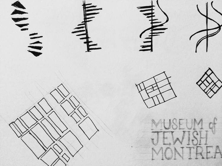
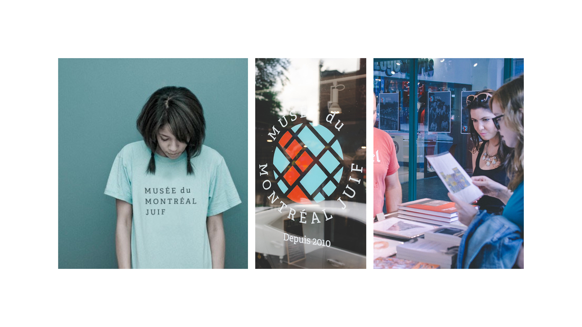
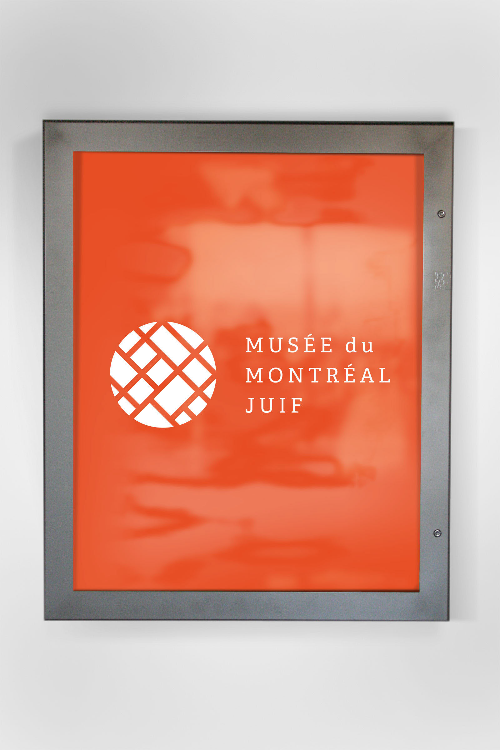
We refined the mark to a circular icon containing a street grid, with certain blocks highlighted in orange.
These can be read as a walking tour itinerary, the presence of heritage sites sprinkled among the rest of the city, or (if you really search for it) a monogram.
These can be read as a walking tour itinerary, the presence of heritage sites sprinkled among the rest of the city, or (if you really search for it) a monogram.

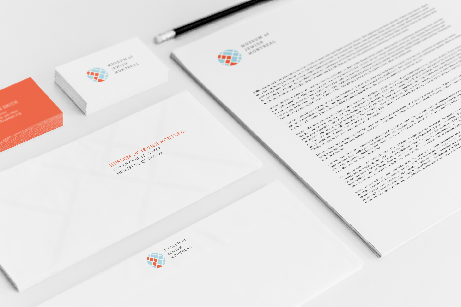
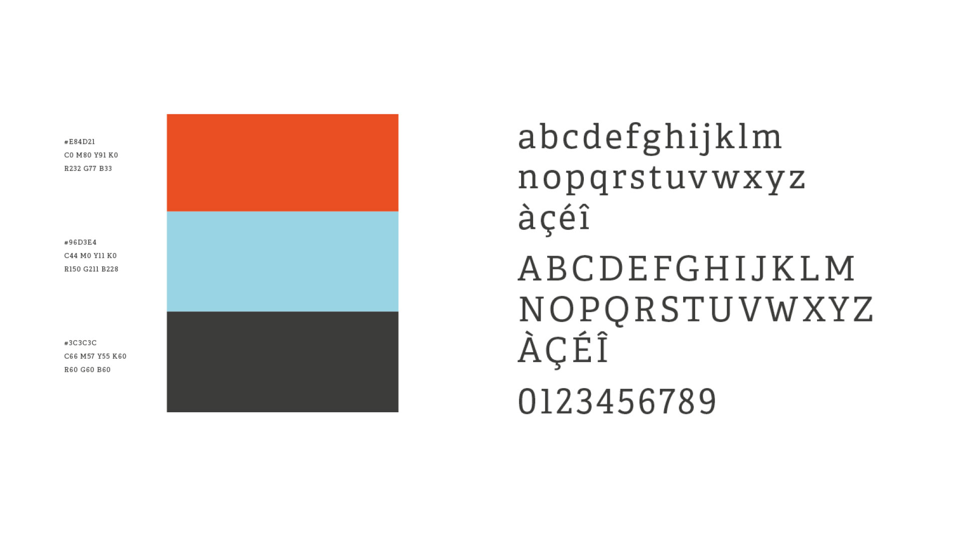
The colour palette was preserved—and slightly refreshed—from the original identity, while the choice of a slab serif as a primary typeface is a nod to the practice of literally writing on slabs of stone. We chose Adelle specifically for its softer, more youthful qualities.
The refreshed brand represented what the museum was all about, resonated with the target audiences, and facilitated the work of creating and designing new products and exhibitions. The museum’s productivity and funding increased, and in 2016, the first permanent site was opened, complete with a boutique and a cafe. In 2022, the museum will reopen in a new location, currently being designed.
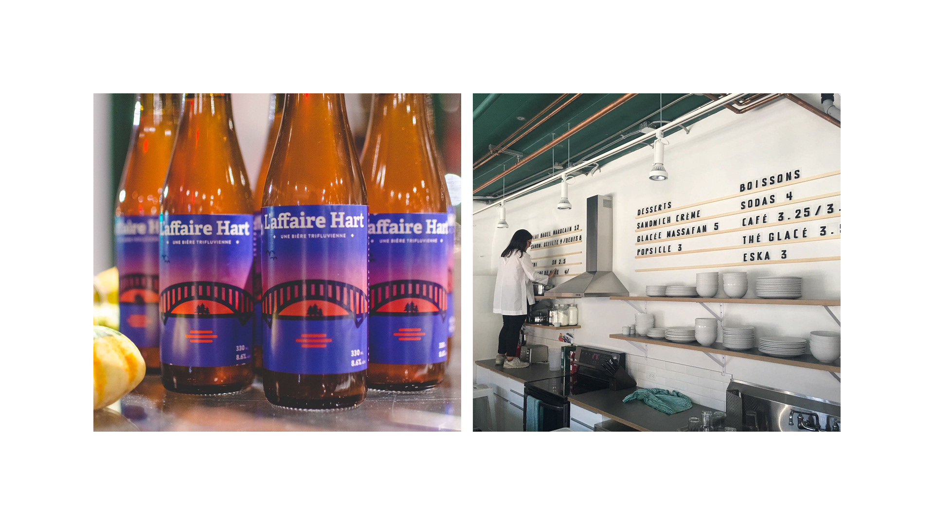
Where possible, I have continued to work with the Museum of Jewish Montreal on various projects, including L’affaire Hart, a reconstruction of a centuries-old beer recipe made by Quebec’s first Jewish family, in collaboration with Reservoir, a local brewery.